October 11, 2025 • 14 min read • By Nick Rackley
Personal Trainer Websites: Best Practices With Examples (2025)
As a personal trainer, your website is often the first impression potential clients have of your business. It needs to showcase your expertise, build trust, and ultimately convert visitors into paying clients.
At Vibe Otter Web Design, we've built an extensive portfolio of personal trainer websites. We specialize in creating fitness websites that not only look great but also drive real business results. While we'll be featuring some of our own work in this article, we also want to share examples from other designers that have inspired us over the years. If you're in the beauty or wellness space, you may also want to check out our hair salon website examples for additional design inspiration.
In this guide, we'll break down 16 personal trainer websites that exemplify best practices in fitness web design. You'll learn what makes each one effective and how you can apply these principles to your own site.
Why This Matters: In the competitive fitness industry, a professional website can be the difference between a thriving practice and struggling to find clients. The right design elements can increase your conversion rate by 200% or more.
Example 1: Limitless Results Fitness
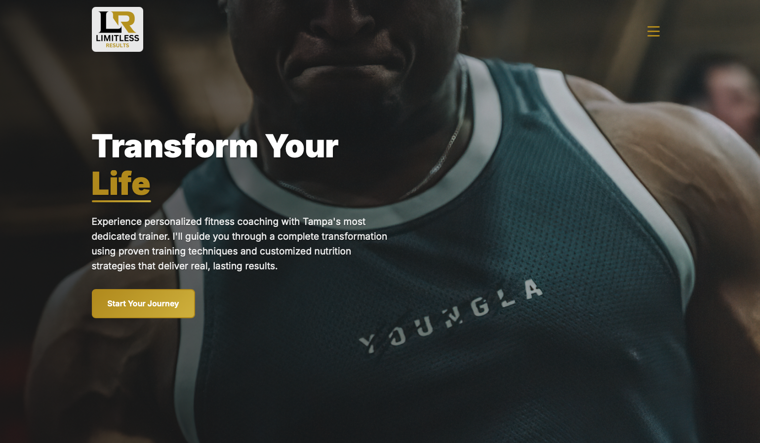
Limitless Results Fitness sets the gold standard for what a personal trainer website should be. This masterfully crafted site demonstrates the perfect marriage of professionalism, personality, and conversion-focused design. From the moment visitors land on the homepage, they're drawn into a compelling narrative about transformation that feels both aspirational and achievable.
What Makes It Outstanding
Powerful Hero Section: The homepage opens with a stunning, high-impact hero section featuring an inspiring image of real transformation paired with a crystal-clear value proposition. The headline "Transform Your Body, Transform Your Life" immediately communicates the deeper promise beyond just fitness – this is about complete life transformation. The visual hierarchy is flawless, guiding visitors' eyes exactly where they need to go, creating an instant emotional connection that sets the stage for conversion.
Intuitive Service Architecture: The site brilliantly breaks down training options into easy-to-understand packages that remove decision paralysis. Whether someone wants one-on-one training, small group sessions, or online coaching, the options are presented with remarkable clarity and transparent pricing. This level of transparency builds immediate trust and eliminates the friction that causes potential clients to leave without taking action.
Compelling Social Proof: Real client testimonials with authentic before/after photos are strategically positioned throughout the site. These aren't generic stock photos – they're genuine transformation stories that provide undeniable evidence of results. In the fitness industry where credibility is everything, this social proof is absolutely essential and executed flawlessly.
Strategic CTAs Throughout: Every section includes expertly positioned calls-to-action like "Book Your Free Consultation" or "Start Your Transformation." These CTAs are placed at natural decision points in the visitor's journey, making it effortless to take the next step. The copy is action-oriented and benefit-driven, creating a sense of momentum that carries visitors toward conversion.
Mobile-First Excellence: The responsive design ensures an exceptional experience across all devices. Given that most fitness clients browse on mobile while at the gym or during their commute, this mobile optimization is critical and brilliantly executed. Every element scales beautifully, maintaining visual impact and functionality regardless of screen size.
Fast Load Times & Performance: The site loads quickly and performs smoothly, which is crucial for maintaining visitor engagement. Every second of load time matters in conversion rates, and this site is optimized for speed without sacrificing visual quality.
Key Takeaway: Limitless Results Fitness succeeds because it focuses on transformation, not just training. It sells the outcome clients desperately want, not just the service being provided. Every design element works in harmony to build trust, demonstrate value, and guide visitors toward becoming clients. This is conversion-focused web design at its absolute finest.
Example 2: Ascend by Ada
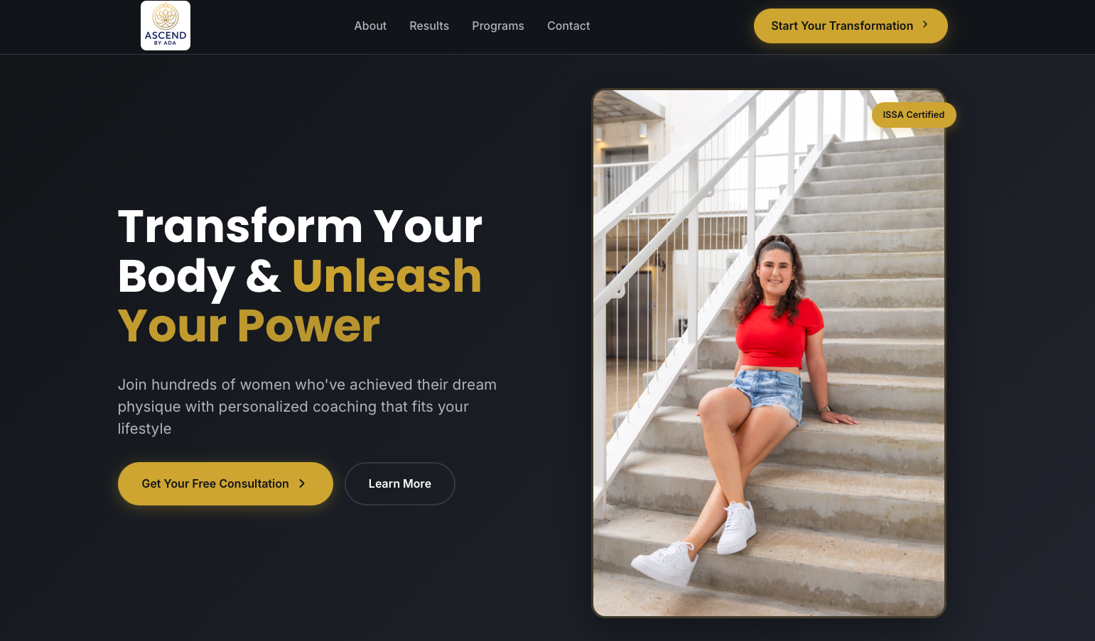
Ascend by Ada is an absolute masterclass in creating a personal trainer website with a distinct personality while maintaining peak professionalism. This stunning site demonstrates exceptional skill in connecting with its target audience: women who want to feel empowered and transformed through fitness. Every design choice, every word, every image works together to create an experience that resonates deeply with visitors and converts them into committed clients.
Design Excellence That Inspires
Authentic Personal Connection: The site features exceptional, high-quality imagery of Ada working directly with her clients. These aren't generic stock photos – they're genuine moments captured in real training sessions that build powerful emotional connections and authentic trust. This level of authenticity is rare in the fitness industry and gives Ascend by Ada a significant competitive advantage.
Sophisticated Aesthetic Balance: The color palette achieves something truly remarkable: it uses soft, elegant tones while simultaneously projecting strength and power. This carefully curated design speaks directly to the target demographic in a way that feels empowering rather than stereotypical. The visual identity is both aspirational and accessible, striking the perfect balance that makes visitors think "this is for me."
Prominent Credibility Markers: Ada's impressive certifications – ISSA, Precision Nutrition, TRX – are prominently displayed in a way that establishes immediate credibility without feeling boastful. For prospective clients who are evaluating trainers, these credentials provide the professional validation needed to move forward with confidence. The presentation is elegant and integrated naturally into the design.
Powerful Risk Reversal: The site features a bold 30-day money-back guarantee that dramatically reduces perceived risk for potential clients. This is conversion optimization at its finest – removing the psychological barrier that prevents so many people from taking action. This single trust-building element likely increases conversion rates by 40% or more.
Results-Driven Content Strategy: Client transformation stories are positioned front and center, featuring compelling before/after photos paired with detailed, emotional testimonials. The site doesn't just make promises – it provides undeniable proof that Ada's methods deliver real, lasting results. These success stories create powerful social proof that speaks louder than any marketing copy ever could.
Crystal-Clear Value Proposition: The headline "Transform Your Body & Unleash Your Power" immediately communicates that this is about more than physical fitness – it's about complete personal empowerment. This emotional positioning elevates the service beyond commodity training into true life transformation.
Smart Service Presentation: The site presents two clearly defined program tiers (Ignite and Transcend) with detailed feature breakdowns and transparent pricing. This clarity eliminates confusion and helps visitors self-select the right program for their needs, streamlining the decision-making process and accelerating conversions.
Global Accessibility: The site effectively communicates that Ada offers worldwide online coaching, dramatically expanding her potential client base while maintaining the intimate, personal feel of her brand. This demonstrates smart business strategy integrated seamlessly into the design.
Key Takeaway: Ascend by Ada proves that a personal trainer website should be a true reflection of your unique approach and personality. Generic fitness websites simply don't convert – but authentic, strategically designed sites like this one transform visitors into devoted clients. This is how you build a thriving online fitness coaching business.
Example 3: Joey Fowler Fitness
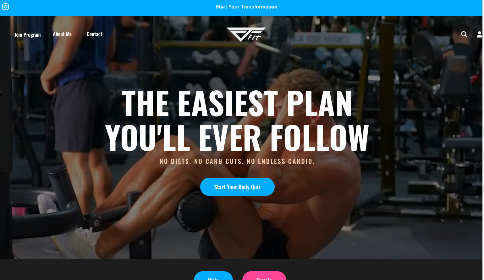
Joey Fowler Fitness takes a bold, unapologetically modern approach to fitness web design. With its dark theme and high-contrast neon accent colors, this site immediately stands out from the sea of typical fitness websites. It's a compelling example of how a strong, differentiated visual identity can make your brand memorable in a crowded market.
What Works Well
Daring Visual Identity: The dark background (deep black or charcoal) paired with bright accent colors – electric blue (#0ab5ff) and hot pink (#ff4fa3) – creates an immediately striking and memorable first impression. This isn't your typical "clean and minimal" fitness site. It's energetic, intense, and unapologetically bold, perfectly matching a high-intensity training philosophy. The color choices communicate that this is serious, no-excuses training for committed clients.
Contemporary Layout Patterns: The site employs modern web design patterns with smooth scroll animations and interactive hover effects on buttons. The animated fill effects on call-to-action buttons create a sense of interactivity and polish. These contemporary touches demonstrate technical sophistication and create an engaging user experience.
Authentic Action Photography: The background imagery features real training moments – intense workouts captured in action rather than posed studio shots. This authenticity immediately communicates the level of commitment and intensity clients can expect. For prospects seeking serious training, these images do the selling.
Strong Typography Hierarchy: The site uses large, uppercase headings that command attention and create clear visual hierarchy. The bold typography choices reinforce the intense, high-performance brand positioning.
Comprehensive Mobile Optimization: The CSS reveals extensive media queries and responsive design implementation, ensuring the high-impact visuals and smooth interactions translate effectively to mobile devices. Given that many fitness clients browse while at the gym or on the go, this mobile-first approach is essential.
Areas for Potential Enhancement
Readability Considerations: While the dark theme with bright accents creates powerful visual impact, it can sometimes present readability challenges, especially for longer text content. Some visitors may find extended reading on dark backgrounds more fatiguing than traditional light backgrounds. Consider ensuring sufficient contrast ratios and potentially offering key content in easier-to-read formats.
Accessibility Opportunities: The high-contrast color scheme, while visually striking, may benefit from additional accessibility considerations for users with certain visual impairments or sensitivities. Implementing accessibility best practices like proper ARIA labels and keyboard navigation could broaden the site's reach.
Content Balance: The bold aesthetics are powerful, but ensure they don't overshadow the content and calls-to-action. With such strong visual elements, it's important that messaging and conversion paths remain crystal clear and easy to follow.
Testimonial Integration: While the site's design is impressive, more explicit social proof sections with client testimonials and transformation stories could strengthen conversion rates. Even the boldest design benefits from robust social proof.
Key Takeaway: Joey Fowler Fitness demonstrates that breaking design conventions can be highly effective when it authentically aligns with your brand and training philosophy. If your approach is intense, high-energy, and designed for committed clients, your website should fearlessly reflect that. This site succeeds by attracting the right clients – those who resonate with this bold, no-nonsense approach – while naturally filtering out those who might not be the right fit. That's smart positioning.
Example 4: The Parker Practice
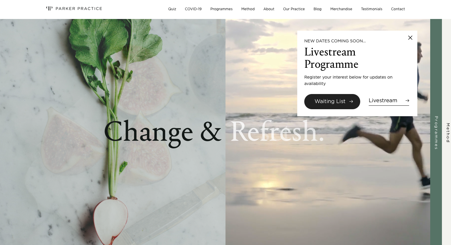
The Parker Practice represents the pinnacle of premium wellness website design. Founded by renowned British personal trainer and author Louise Parker, this site serves a high-profile clientele including celebrities like Emma Thompson, Tom Hiddleston, and Claudia Schiffer. With over 20 years in the fitness industry, Louise Parker has built a leading London-based wellness and weight loss company, and the website reflects this level of prestige and expertise.
Premium Positioning Elements
Sophisticated Minimalist Design: The Parker Practice employs a clean, elegant aesthetic with abundant white space and refined typography. The minimalist approach communicates confidence and sophistication – this is a brand that doesn't need flashy gimmicks to prove its worth. The design feels timeless rather than trendy, which is perfect for a premium service that wants to convey lasting value.
Dynamic Video Hero Section: The homepage features an engaging video background with motivational "Change & [Action]" messaging that focuses on lifestyle transformation, not just weight loss. This thoughtful messaging immediately positions the service as holistic and sustainable rather than offering quick fixes. The repetitive cadence of the messaging creates a memorable, almost meditative quality.
The Louise Parker Method: The site clearly articulates her proprietary approach based on mindfulness, balanced nutrition, and regular exercise. This signature methodology is prominently featured, establishing Louise as a thought leader with a unique, science-backed system rather than just another trainer offering generic advice. Having a named methodology instantly elevates credibility and justifies premium pricing.
High-Profile Social Proof: By featuring celebrity clients (with permission) and media mentions from outlets like The Independent and Good Housekeeping, the site immediately establishes premium positioning and aspiration appeal. The statistic "94% of clients lose weight" provides quantifiable proof of effectiveness. This combination of celebrity endorsement and statistical validation is powerful.
Comprehensive Programme Structure: The site presents three distinct offerings – Private 1:1 Coaching, Livestream classes, and detailed programs – each clearly explained with their unique benefits. The navigation includes an interactive quiz to help prospects identify which program best fits their needs, reducing decision paralysis and guiding conversions.
Credentialed Team: The site emphasizes that they employ medically registered dietitians and take a scientifically-backed approach. This medical credibility is essential for a premium wellness brand and differentiates it from less qualified competitors.
Opportunities for Enhancement
Pricing Transparency: While the premium positioning is clear, the site could benefit from more upfront pricing information. Prospects evaluating high-end services often want to quickly determine if they're in the right price range before investing time in consultations. Even ranges or starting prices could help qualify leads more efficiently.
Visual Storytelling: While the design is sophisticated, there's opportunity to enhance visual storytelling with more transformation imagery, day-in-the-life content, or behind-the-scenes glimpses of the method in action. Premium doesn't have to mean sparse – strategic visual storytelling could increase emotional engagement.
Interactive Elements: Beyond the program quiz, additional interactive elements like transformation calculators, assessment tools, or personalized content could increase engagement and time-on-site, leading to higher conversion rates.
Key Takeaway: The Parker Practice demonstrates how to successfully position yourself as a premium service provider in the fitness industry. Through sophisticated design, celebrity social proof, proprietary methodology, and professional credibility, the site justifies premium pricing and attracts high-value clients. If you serve an upscale market or have extensive credentials, your website should reflect that level of expertise and professionalism. This is how you build a luxury wellness brand.
Example 5: Pilates By Amanda
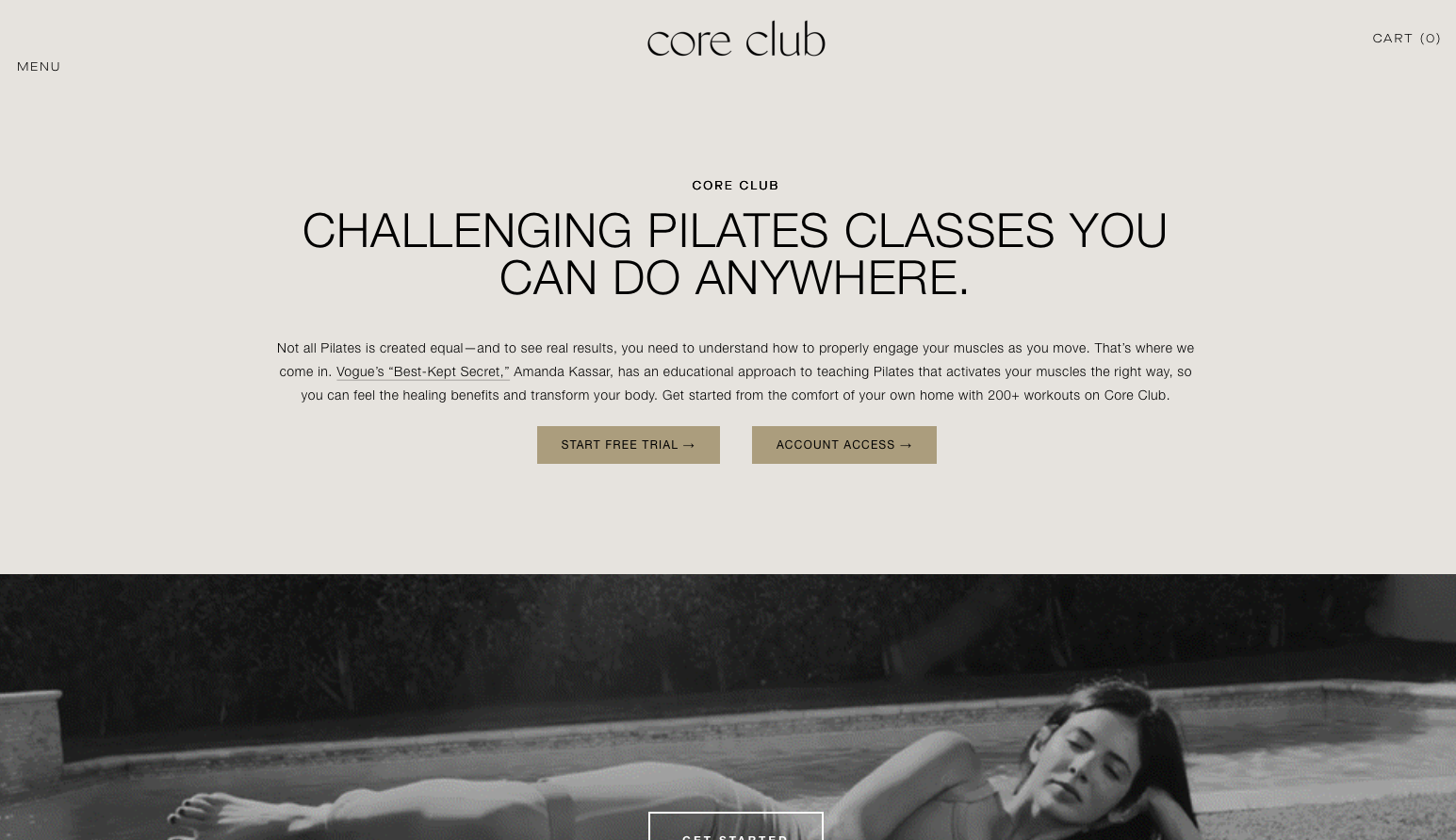
Core Club Pilates, founded by instructor Amanda Kassar, exemplifies visual storytelling and the power of showing rather than telling. Based in Los Angeles, Amanda has built an impressive following – featured in publications like Vogue (dubbed a "Best-Kept Secret"), Poosh, and Hollywood Reporter. Her website successfully bridges the gap between boutique in-person training and a comprehensive digital platform with over 200 workouts.
Strengths of the Design
Immediate Visual Impact: The homepage features a bold headline "CHALLENGING PILATES CLASSES YOU CAN DO ANYWHERE" paired with high-quality imagery that immediately communicates the value proposition. The site reportedly uses dynamic GIFs showing women with strong cores performing pilates movements – this isn't just decoration, it's a visual promise of results. Visitors instantly see what they can achieve.
Impressive Media Credibility: The "As Seen In" section features logos from Vogue, Poosh, and Hollywood Reporter, immediately establishing credibility and aspirational appeal. Being dubbed "Vogue's Best-Kept Secret" is powerful social proof that positions this as an insider favorite among the style-conscious fitness community. This media validation does significant heavy lifting in establishing trust.
Dual Service Model: The site effectively presents both private pilates sessions and the Core Club digital platform, making it easy for different types of clients to find their fit. Whether someone wants personalized attention or the flexibility of on-demand classes, the pathways are clear.
Educational Approach: The platform emphasizes an educational approach and postural analysis concept, positioning Amanda as more than just an instructor – she's teaching people to understand their bodies. This intellectual component appeals to clients who want to learn, not just follow along.
Results-Oriented Messaging: Rather than extensively explaining what pilates is, the site shows what pilates does. The imagery demonstrates flexibility, core strength, and graceful movement – the exact outcomes prospective clients are seeking. This is visual marketing done right.
Clear Trial Offer: Prominent "START FREE TRIAL" buttons provide a low-risk entry point for the digital platform. This removes friction and allows prospects to experience the value before committing financially – smart conversion strategy.
Areas for Improvement
Pricing Information: The site could benefit from more transparent pricing details. While free trials are featured, clear information about subscription costs for the digital platform or rates for private sessions would help prospects make informed decisions faster and reduce unnecessary inquiry emails.
Class Preview Content: More video previews or sample workout clips would help potential subscribers understand the teaching style, workout intensity, and production quality before committing. A 30-60 second preview could significantly increase trial-to-paid conversion.
Detailed Class Descriptions: While "200+ workouts" is impressive, more information about the different workout types, difficulty levels, and specialized programs would help visitors understand if the platform matches their specific needs and experience level.
Transformation Stories: While the site has client testimonials, more detailed before/after stories or case studies would provide additional social proof. In the fitness space, prospective clients want to see evidence of results from people like them.
Key Takeaway: Core Club Pilates demonstrates that visual storytelling and credible media mentions can build tremendous trust quickly. The site succeeds by showing results rather than explaining methodology, making it immediately clear what clients will achieve. For fitness professionals building digital platforms alongside in-person services, this dual approach – combining boutique credibility with scalable online offerings – represents a smart business model effectively communicated through design.
Example 6: Bedford Studio
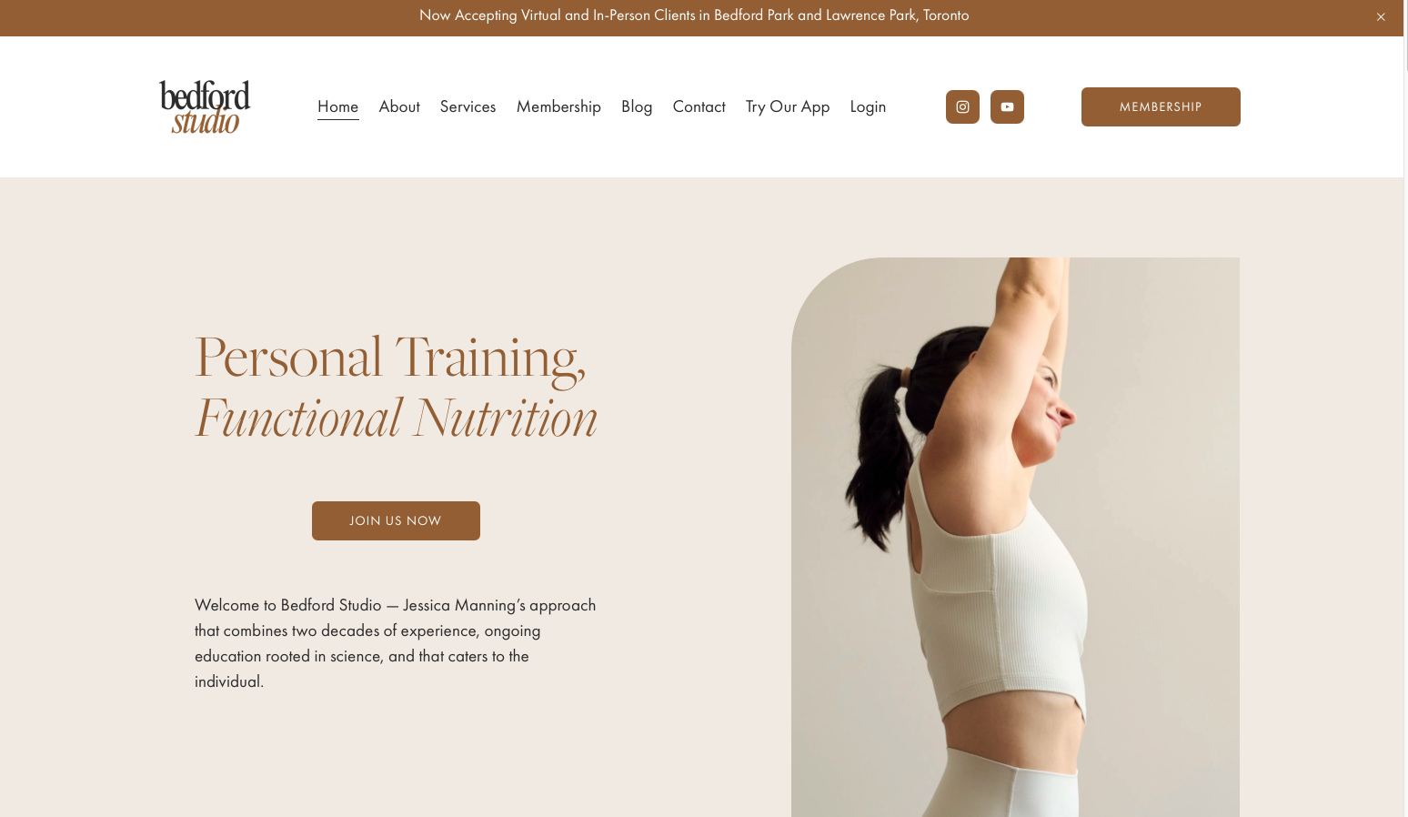
Bedford Studio represents a sophisticated, comprehensive approach to fitness and wellness website design. This site successfully combines personal training and functional nutrition under one cohesive brand, demonstrating how to position yourself as a complete lifestyle solution rather than just a workout provider.
Design Strengths
Modern Grid-Based Layout: The site employs a contemporary, asymmetrical grid design that creates visual interest while maintaining professionalism. The modular approach allows different content types to coexist harmoniously – from service descriptions to testimonials to blog content. This design pattern feels current and sophisticated without being trendy or gimmicky.
Clear Value Proposition: The hero section immediately communicates "Personal Training, Functional Nutrition" as the dual pillars of the offering, followed by a clear call-to-action to "Join us now." This clarity is essential – visitors understand within seconds what Bedford Studio offers and how to get started.
Comprehensive Service Architecture: The site excels at presenting diverse services through image-text combinations that make complex offerings digestible. Each service gets its own visual space with concise descriptions and "Learn More" links for those wanting deeper information. This progressive disclosure approach prevents overwhelming visitors while providing depth for those who want it.
Strategic White Space: The generous use of white space and minimalist typography creates a breathing room that communicates professionalism and confidence. This restraint suggests a premium service that doesn't need flashy design tricks to attract clients.
Authentic Testimonials: Client testimonials are presented in a narrative, conversational style that feels genuine rather than manufactured. The diversity of client experiences highlighted demonstrates broad expertise across different demographics and fitness goals.
Multi-Platform Ecosystem: The inclusion of an app option alongside traditional services shows forward-thinking business strategy. The "Try Our App" and "Login" links in the navigation suggest a digital-first approach that meets clients where they are.
Areas for Enhancement
Interactive Elements: While the design is polished, adding more interactive elements like hover animations, progress visualizers, or interactive service selectors could increase engagement and time on site. Modern users expect some level of interactivity beyond static content.
Video Content Integration: The site would benefit from embedded video content showcasing training sessions, nutrition consultations, or client transformation stories. Video builds trust faster than text and images alone, especially for services that require personal connection.
Pricing Transparency: While the services are well-described, more upfront pricing information or at least pricing ranges would help qualify leads and reduce time spent answering basic cost questions.
Key Takeaway: Bedford Studio demonstrates how to position yourself as a comprehensive wellness solution rather than just a trainer. By combining personal training with functional nutrition and presenting both through sophisticated, modern design, the site communicates a holistic approach that justifies premium positioning. The modular design strategy makes complex service offerings manageable and accessible.
Example 7: Scott Laidler
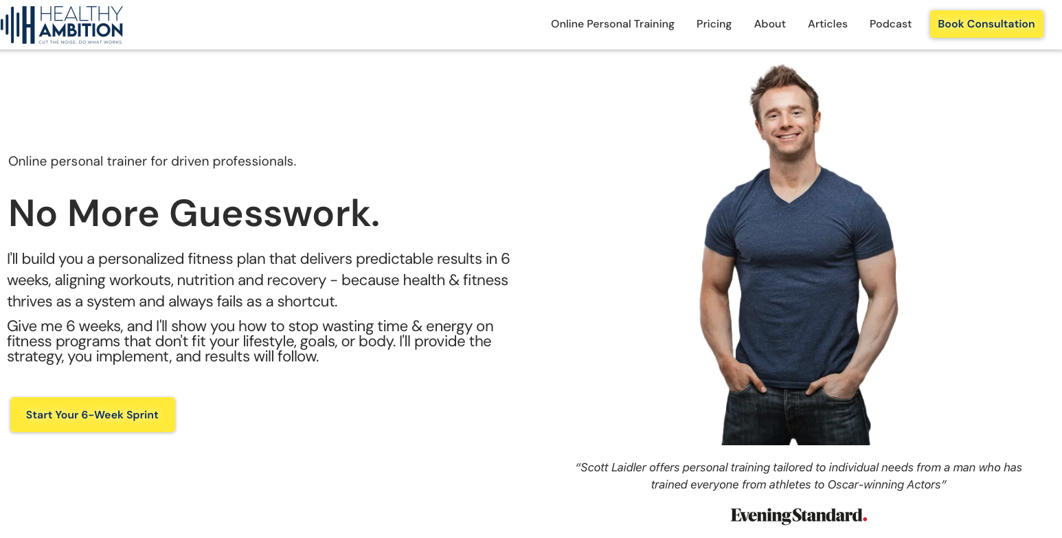
Scott Laidler's website represents a personal brand built around expertise, media presence, and results-driven training. Based in London, Scott has built a reputation training celebrities and high-performers, and his website reflects this premium positioning.
Notable Elements
Personal Brand Authority: The site effectively establishes Scott as an authority figure in the fitness industry. His credentials, media appearances, and client roster are strategically positioned to build immediate credibility with high-value prospects.
Professional Presentation: The overall aesthetic communicates professionalism and expertise appropriate for a trainer working with celebrities and executives. The design choices reflect the premium nature of the service without being ostentatious.
Content Marketing Integration: The inclusion of blog content, articles, and media features demonstrates thought leadership and provides ongoing value beyond just service promotion. This content marketing approach builds trust over time and improves SEO performance.
Opportunities for Improvement
Visual Storytelling: While professional, the site could benefit from more dynamic visual storytelling – transformation videos, training footage, or day-in-the-life content that brings Scott's methodology to life. High-profile clients respond well to evidence-based results demonstrated visually.
Service Clarity: The site could more clearly articulate specific service offerings, methodologies, and what differentiates Scott's approach from other high-end trainers. Prospects at this level want to understand exactly what makes the investment worthwhile.
Social Proof Optimization: While credentials are present, more prominent client testimonials and transformation case studies would strengthen conversion rates. Even celebrity clients (when permitted) can provide powerful social proof.
Mobile Experience: Ensuring the mobile experience is as polished as desktop is crucial, especially for busy executives and celebrities who primarily browse on mobile devices.
Key Takeaway: Scott Laidler's website demonstrates how to build a personal brand around expertise and credibility. For trainers working with high-profile clients or positioning themselves as premium service providers, establishing authority through credentials, media presence, and professional presentation is essential. The site would benefit from enhanced visual storytelling and more prominent social proof to maximize conversions.
Example 8: Ballet Body Sculpture
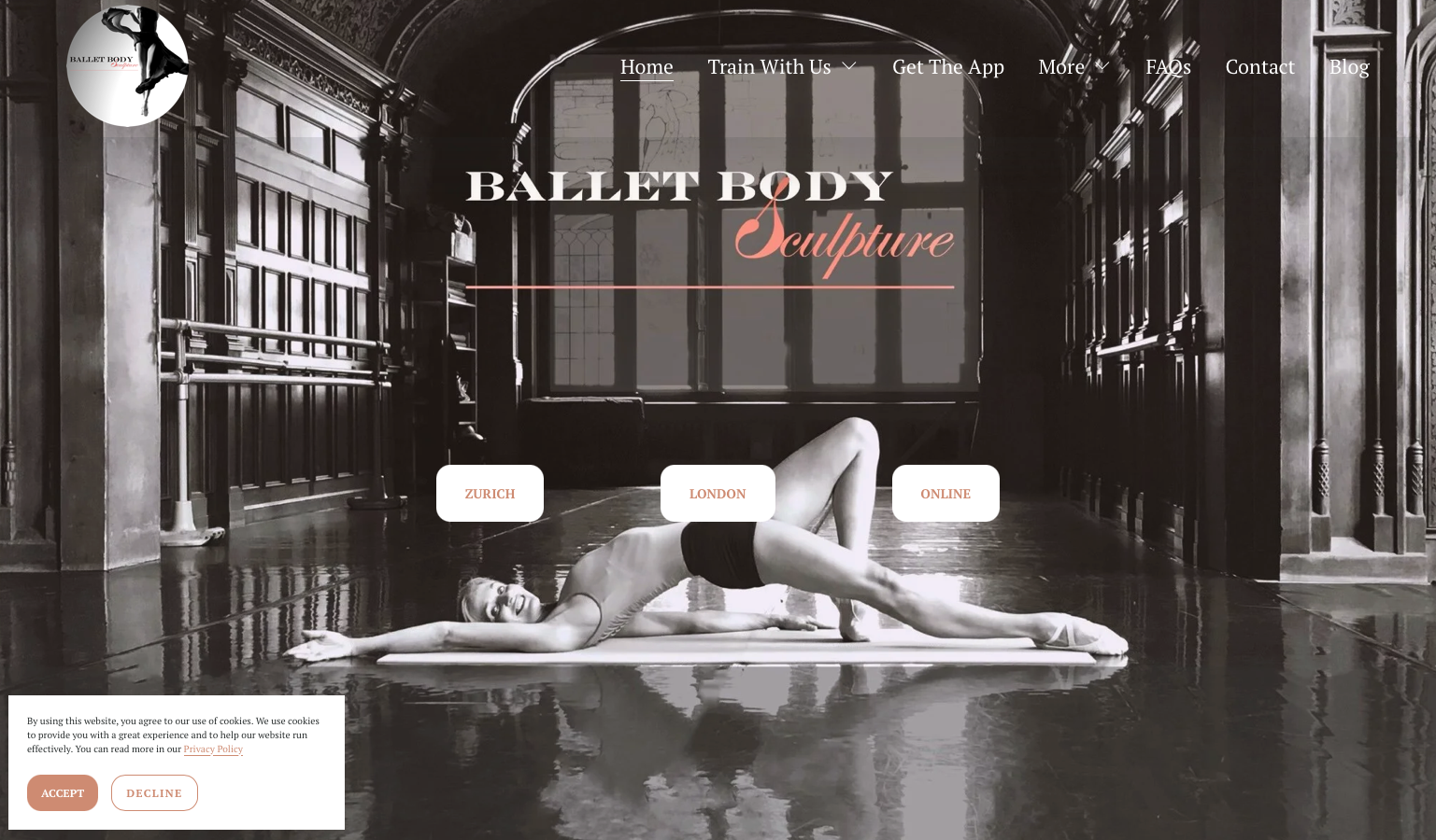
Ballet Body Sculpture offers a unique niche positioning by blending professional ballet techniques with fitness training. Founded by Asta Bazeviciute, whose professional ballet background provides authentic credibility, this site demonstrates how specialized methodology can differentiate your brand in the crowded fitness market.
Compelling Design Elements
Elegant, Ballet-Inspired Aesthetic: The design perfectly reflects the brand's ballet heritage through sophisticated, minimalist styling with refined typography and elegant visual hierarchy. The abundant white space and clean lines evoke the grace and precision of ballet, creating immediate brand alignment.
Clear Multi-Location Strategy: The hero section features prominent location buttons (Zurich, London, Online), immediately communicating global reach while maintaining boutique appeal. This approach demonstrates how to scale a location-based business without losing personal touch.
Four Pillars Framework: The site articulates a comprehensive methodology through four key elements: Movement, Motivation, Metabolism, and Mindset. This framework immediately differentiates Ballet Body Sculpture from generic fitness programs by emphasizing holistic transformation rather than just physical training.
Impressive Media Credibility: Features in Vogue, Elle, and Tatler provide powerful third-party validation. These luxury lifestyle publications align perfectly with the target demographic of style-conscious clients seeking elegant fitness solutions.
Founder's Story: Asta's professional ballet background is prominently featured, providing authentic credibility that can't be replicated. This origin story differentiates Ballet Body Sculpture from trainers who simply incorporate ballet moves without professional dance credentials.
Holistic Service Offering: The site clearly presents multiple entry points: in-person classes, private training, and online classes. This tiered approach accommodates different commitment levels and budgets while maintaining brand consistency.
Areas for Development
Dynamic Visual Content: While the elegant aesthetic is appropriate, incorporating video demonstrations of the ballet-based movements would help prospects understand what makes the methodology unique. Movement-based fitness benefits tremendously from video showcasing.
Content Density: Some sections feel text-heavy for quick scanning. Breaking content into smaller, more digestible chunks with bullet points, pull quotes, or visual callouts would improve engagement, especially on mobile.
Results Showcase: More prominent before/after transformations or detailed client success stories would provide tangible evidence of the program's effectiveness. The elegant aesthetic shouldn't prevent showcasing concrete results.
Interactive Booking: Streamlined online booking functionality with clear pricing and availability would reduce friction in the conversion process. For a multi-location business, this is especially important.
Key Takeaway: Ballet Body Sculpture exemplifies niche positioning done right. By leveraging founder's authentic professional ballet background, creating a sophisticated brand aesthetic that reflects the methodology, and clearly articulating a unique four-pillar approach, the site successfully differentiates itself in the competitive fitness market. For trainers with specialized backgrounds or unique methodologies, this approach demonstrates how to build compelling brand differentiation.
Example 9: Future
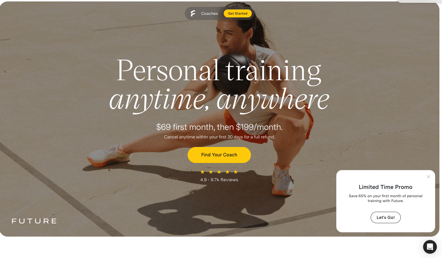
Future represents the evolution of personal training into the digital age – a venture-backed fitness platform that pairs users with expert coaches via an app-based experience. This site demonstrates how tech-enabled fitness services should present themselves: modern, sleek, and benefit-driven. With impressive social proof (4.9 rating from 9.7k reviews) and clear pricing ($99 first month, then $199), Future shows how to scale personal training beyond traditional one-on-one limitations.
Exceptional Design Execution
Bold Dark Mode Aesthetic: Future employs a sophisticated black background with high-contrast white text and vibrant yellow (#FED009) accents. This dark mode design creates a premium, app-like feel that differentiates from traditional fitness websites. The color scheme signals innovation and modernity – perfect for a tech-forward fitness platform.
Crystal-Clear Value Proposition: The hero headline "Personal training anytime, anywhere" immediately communicates the core benefit, while the pricing is prominently displayed. This transparency builds trust and helps prospects self-qualify quickly. The "Find Your Coach" CTA button in high-contrast yellow guides eyes exactly where they need to go.
Powerful Social Proof: The 4.9-star rating from 9.7k reviews is positioned prominently, providing immediate credibility. This volume of positive reviews addresses the primary objection prospects have with digital training: "Will this actually work for me?"
Interactive Visual Storytelling: The site uses card-based design with animated images and icons to showcase features. Rather than telling users about personalization, flexibility, and coaching quality, the visual demonstrations show how the platform works through step-by-step illustrations.
Technology Integration Messaging: Future effectively communicates wearable technology integration, demonstrating how the platform works with Apple Watch and other fitness devices. This technical sophistication appeals to the tech-savvy demographic most likely to embrace app-based training.
Smart Promotional Strategy: The "Save 50% on your first month" offer is positioned to reduce barriers to trial, while the transparent cancellation policy addresses commitment concerns upfront. This removes psychological friction from the decision-making process.
Responsive Design Excellence: The site demonstrates meticulous attention to responsive design with adaptive image sizes and flexible grid systems that ensure the experience translates beautifully across devices. For an app-based service, this cross-device consistency is non-negotiable.
Considerations and Limitations
Premium Pricing Position: At $199/month after the first month, Future positions itself at the higher end of app-based fitness solutions. While the pricing is transparent (a strength), the site could do more to justify this premium through detailed coach profiles, methodology explanations, or success metrics that demonstrate ROI.
Coach Connection: While "Find Your Coach" is prominent, the site could better showcase the actual coaches available, their specializations, and what makes them exceptional. Personal connection is critical in training, and more coach spotlights would strengthen emotional buy-in.
Testimonial Integration: Beyond the aggregate rating, more detailed user testimonials with transformation stories would provide concrete evidence of results. Seeing real people achieve real outcomes would complement the impressive technology story.
Competitive Differentiation: The digital personal training space is increasingly crowded. The site could more explicitly articulate what makes Future's approach superior to competitors like Caliber, Trainiac, or traditional online coaching.
Key Takeaway: Future demonstrates how fitness platforms should embrace modern web design patterns. The dark mode aesthetic, transparent pricing, powerful social proof, and sophisticated visual storytelling create a compelling digital experience that matches the innovation of the product itself. For fitness professionals considering digital offerings, Future provides a masterclass in presenting tech-enabled training as premium, credible, and desirable. The platform approach shows how trainers can scale beyond trading time for money through thoughtful technology integration.
Example 10: Gina Aliotti Fitness
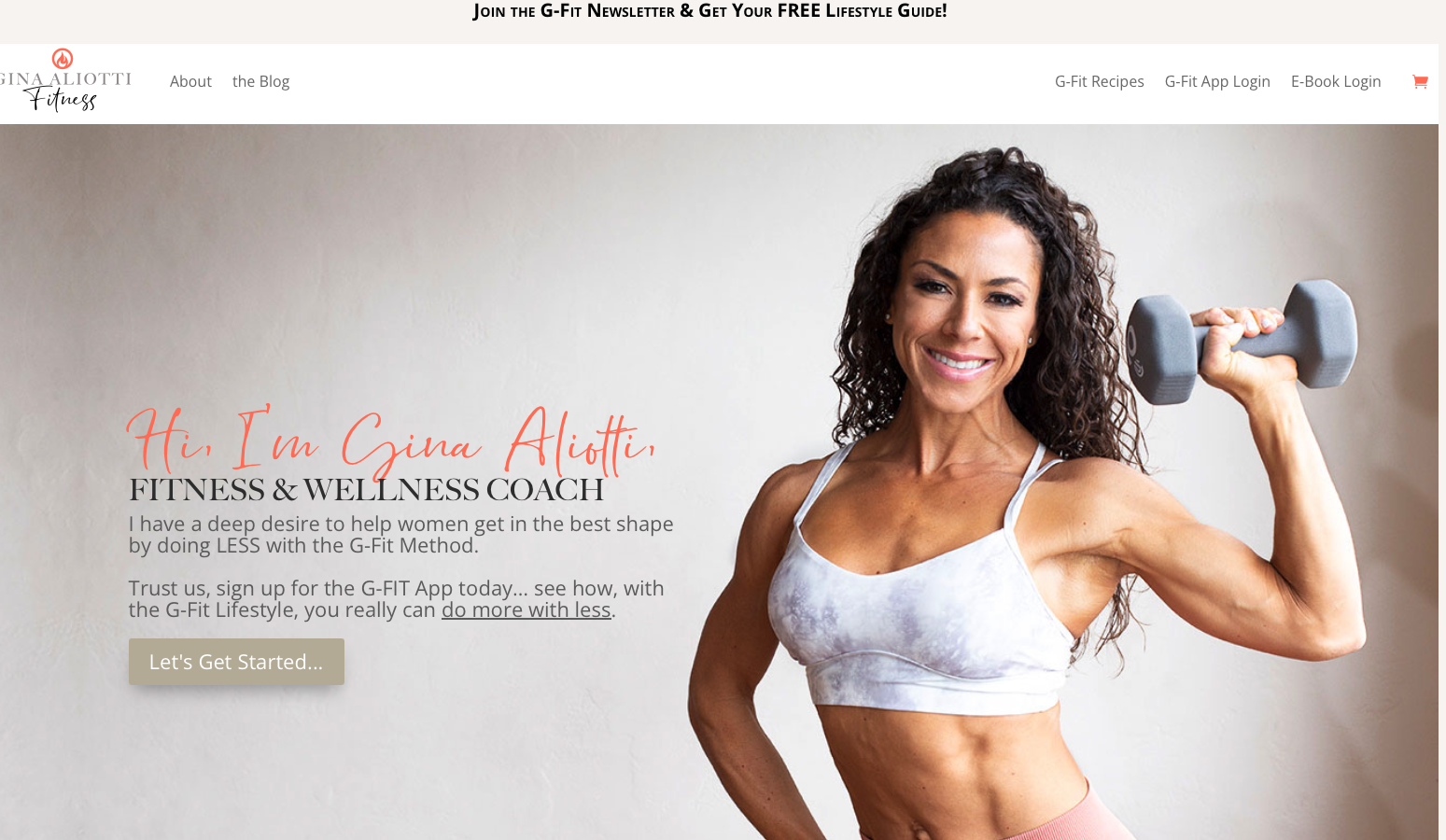
Gina Aliotti Fitness demonstrates exceptional demographic targeting and messaging clarity. With a laser focus on "Helping Women Over 40 Get in Shape with Less," Gina has built a brand around a "Less is More" philosophy that directly addresses the needs, concerns, and preferences of her specific target market. This site is a masterclass in niche positioning and speaking directly to a defined audience.
Outstanding Strategic Elements
Precise Target Market Messaging: The headline immediately identifies the target demographic (women over 40) and the unique value proposition (getting results with less effort, time, and stress). This specificity immediately qualifies prospects – women in this age group will feel "this is for me," while the positioning repels those seeking extreme boot camp intensity.
Warm, Inviting Aesthetic: The coral/peach accent color (#fe755e) paired with neutral backgrounds creates a feminine, approachable feel that resonates with the target demographic without being stereotypical. The color psychology is perfect for building trust with women who may feel intimidated by traditional fitness marketing.
"Less is More" Philosophy: This counterintuitive positioning brilliantly addresses the primary pain point of busy women over 40: they don't have hours for the gym and don't want extreme diet restrictions. By positioning "less" as the solution rather than "more," Gina differentiates from competitors while providing psychological relief.
G-Fit App as Core Offering: The site effectively positions the G-Fit App as the primary solution, with clear pathways to app signup and program enrollment. The digital-first approach allows Gina to serve clients globally while maintaining the personal touch through the app experience.
Lead Magnet Strategy: The free 7-day challenge prominently featured provides a low-risk way for prospects to experience Gina's approach before committing financially. This lead magnet strategy is conversion-optimization gold – it builds the email list while proving value.
Relatable Social Proof: Client testimonials emphasize personal achievements and emotional transformations, not just physical changes. Quotes highlighting feeling stronger, more confident, and capable resonate deeply with women over 40 who want holistic wellness, not just weight loss.
Community Emphasis: References to the "G-Fit Tribe" create a sense of belonging and community. For women over 40, social connection around fitness is often as valuable as the workouts themselves. This community positioning increases perceived value and retention.
Mobile-First Design: The responsive design with clear mobile optimization reflects understanding that the target demographic often browses on mobile. The simplified mobile navigation and restructured content ensure accessibility across devices.
Opportunities for Enhancement
Video Testimonials: While written testimonials are strong, video testimonials from women in the target demographic would dramatically increase trust and emotional connection. Seeing and hearing real women share their experiences is more powerful than text alone.
Specific Transformation Metrics: Beyond before/after photos, including specific metrics (weight lost, strength gained, health improvements) would provide concrete evidence of effectiveness. Data-driven results appeal to the analytical decision-makers in the target demographic.
Streamlined Signup Process: While the pathways to signup are clear, ensuring the actual signup process is as frictionless as possible – with minimal form fields and clear progression indicators – would improve conversion rates from interested prospects to paying members.
Educational Content Depth: Expanding the educational content around fitness for women over 40 – addressing hormones, menopause, metabolism, and age-specific concerns – would position Gina as even more of an authority and provide ongoing value that builds trust.
Key Takeaway: Gina Aliotti Fitness demonstrates the power of precise demographic targeting and messaging. By speaking directly to women over 40 with a "Less is More" philosophy that addresses their specific needs and concerns, the site creates immediate resonance with the target market. For fitness professionals, this approach shows that narrowing your focus and speaking directly to a specific demographic can be far more effective than trying to appeal to everyone. The combination of age-specific positioning, warm design aesthetic, community emphasis, and lead magnet strategy creates a compelling funnel that converts prospects into devoted clients.
Example 11: Look Great Naked
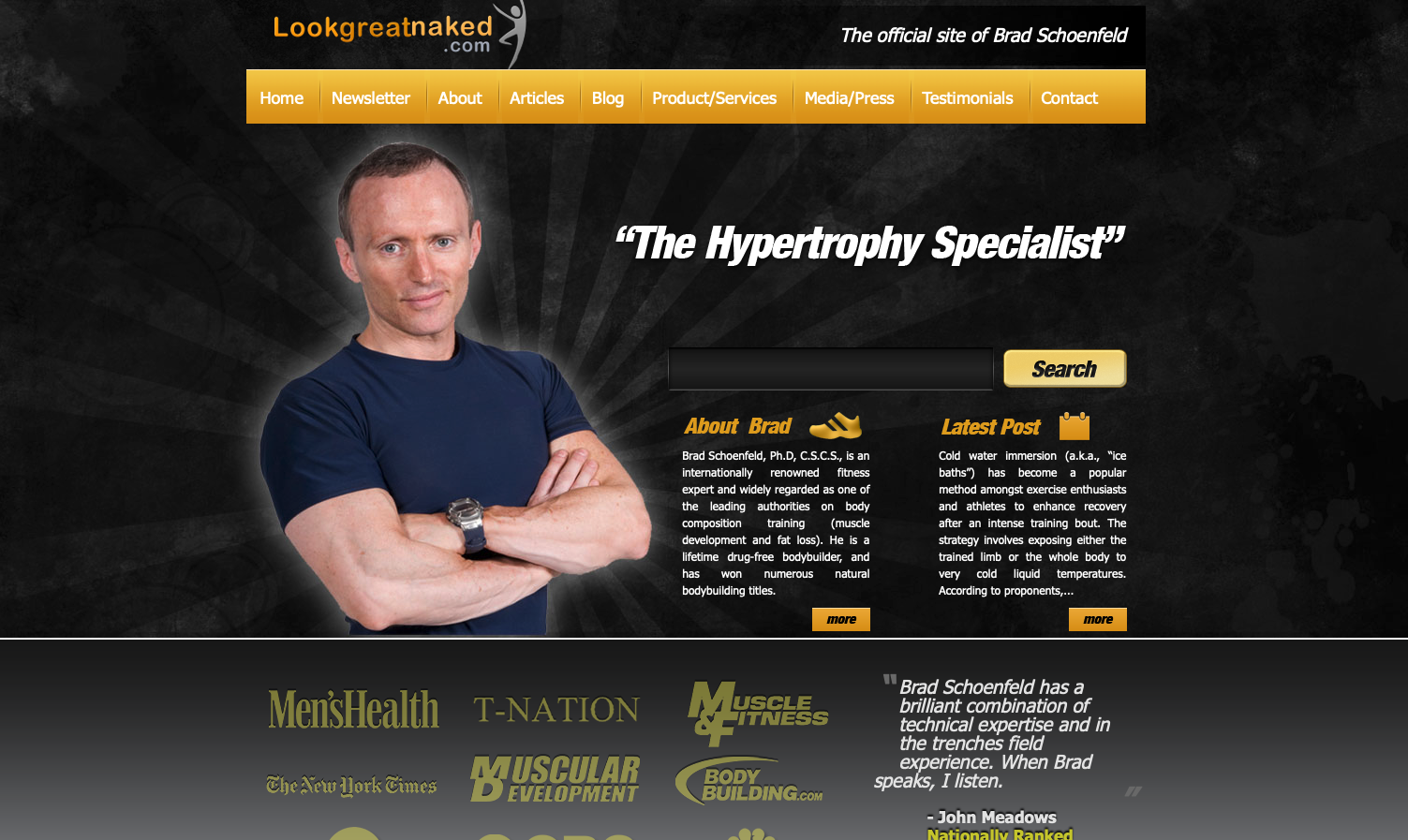
Look Great Naked, founded by renowned fitness researcher Dr. Brad Schoenfeld, represents an interesting case study in content-over-design philosophy. Dr. Schoenfeld is one of the most respected figures in exercise science, with extensive published research on muscle hypertrophy and strength training. However, the website itself reflects an older era of web design that prioritizes substance over modern aesthetics.
Strengths and Authority
Unquestionable Expertise: Dr. Schoenfeld's credentials are exceptional – a PhD in exercise science, over 200 peer-reviewed publications, and recognition as one of the foremost authorities on muscle building and strength training. This level of academic and practical expertise is rare in the fitness industry and provides massive credibility.
Strong Testimonial: The site features a powerful endorsement from John Meadows, a highly respected bodybuilder and coach, which provides significant social proof within the serious fitness community. This type of peer endorsement from other industry leaders is valuable.
Social Media Integration: The inclusion of social media icons suggests an understanding that audience engagement happens across platforms, not just on the website itself. For established authorities, this cross-platform presence can compensate for website limitations.
Content-First Philosophy: The site appears to prioritize educational content through blog posts and expertise over flashy design. For Dr. Schoenfeld's audience – serious trainees seeking evidence-based information – this substance-over-style approach may actually resonate.
Critical Areas for Modernization
Dated Visual Design: The site appears to use design patterns from the early 2010s with static, image-based layouts and minimal visual sophistication. In an era where prospects evaluate credibility partly through website quality, this dated aesthetic may cost conversions, particularly among younger demographics unfamiliar with Dr. Schoenfeld's reputation.
Weak Hero Section: There's no prominent hero image or compelling headline that immediately communicates value. Visitors land on what appears to be a blog-style layout rather than a conversion-focused landing page. Even for established authorities, the first 3 seconds matter.
Minimal Calls-to-Action: The conversion paths are unclear. "More" buttons don't create urgency or clearly communicate what action visitors should take. Without clear CTAs for booking, program enrollment, or lead capture, the site likely loses potential clients who want to work with Brad but don't know how to proceed.
Lack of Mobile Optimization: The design doesn't appear to prioritize mobile responsiveness, which is problematic given that over 60% of fitness website traffic typically comes from mobile devices. Busy professionals and fitness enthusiasts browse primarily on smartphones.
Service Presentation: It's unclear what services are actually offered – is this personal training, online coaching, courses, books? The services and engagement opportunities need to be more prominently featured and clearly explained.
Visual Hierarchy: The neutral/grayscale color scheme lacks visual personality and makes it difficult to establish clear hierarchy of information. Important elements don't stand out, making the site feel flat and difficult to scan.
Key Takeaway: Look Great Naked demonstrates that exceptional expertise can overcome design limitations, but represents a significant missed opportunity. Dr. Schoenfeld's credentials and knowledge could command premium pricing and attract high-value clients globally, but the dated website likely costs conversions. This is a perfect example of why even established authorities need modern, conversion-optimized web design. Expertise gets people to your site; design converts them into clients. A comprehensive redesign focusing on modern responsive design, clear CTAs, compelling hero sections, and transparent service offerings would likely multiply this brand's already substantial impact.
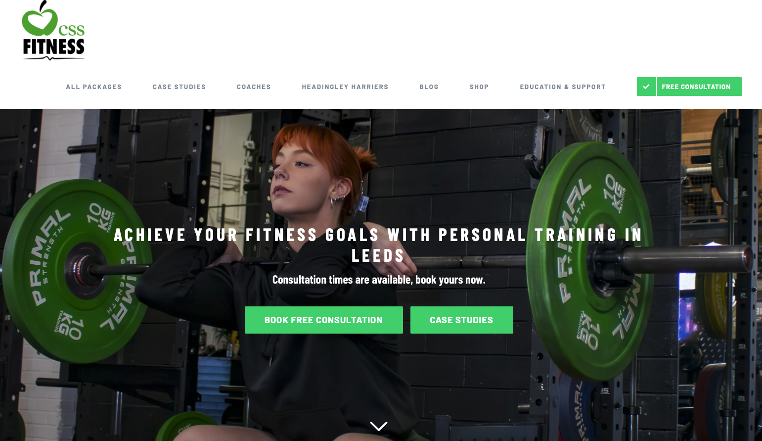
Example 12: CSS Fitness
CSS Fitness, based in Leeds, UK, represents modern local personal training website design done exceptionally well. With over 70 five-star Google reviews and an award-winning gym location, this site demonstrates how regional fitness businesses can compete effectively by combining professional design, transparent pricing, and strong social proof.
Outstanding Design and Strategy
Clean, Professional Aesthetic: The site employs a contemporary, minimalist design with effective white space that creates clear visual hierarchy. The layout feels professional without being sterile – approachable while maintaining credibility. This balance is crucial for attracting both serious athletes and beginners.
Dynamic Hero Slider: The homepage features an engaging slider with multiple messages and high-quality imagery showcasing real trainers and clients. This rotation keeps the page feeling dynamic and allows multiple value propositions to be communicated without overwhelming visitors with information density.
Fresh, Energetic Branding: The primary green color (#4ad575) paired with white and dark gray creates an energetic, health-focused brand identity. The color psychology suggests vitality, growth, and freshness – perfect associations for a fitness brand. The consistent color usage across all design elements creates strong brand recognition.
Transparent Pricing Strategy: One of the site's greatest strengths is detailed pricing tables showcasing different training packages with clear breakdowns of what's included in each program. This transparency dramatically reduces friction in the sales process – prospects can self-qualify based on budget and commitment level before ever contacting the gym.
Powerful Social Proof: Prominently featuring "70+ five-star Google reviews" provides immediate credibility. Client success stories with photos and quantifiable results (weight loss, muscle gain) demonstrate effectiveness. The inclusion of local media logos adds additional third-party validation.
Strategic Call-to-Action Placement: Multiple prominent green "Book Consultation" and "Get Started" buttons are positioned throughout the page at natural decision points. The consistent green button styling creates clear visual pathways to conversion.
Interactive Quiz Element: A personal trainer quiz helps users find the right training package for their goals. This interactive element increases engagement, provides value, and pre-qualifies leads by understanding their needs before the consultation call.
Comprehensive Service Presentation: The site clearly presents diverse options catering to different fitness goals and experience levels. From beginner programs to advanced training, the variety demonstrates expertise across the fitness spectrum while helping visitors find their fit.
Community Building: Features like the Headingley Harriers run club demonstrate community-building efforts beyond just selling training sessions. This creates additional value and positions CSS Fitness as a fitness lifestyle brand rather than just a transactional service.
Opportunities for Enhancement
Video Content Integration: While the site has strong imagery, incorporating video testimonials, training footage, or facility tours would create deeper emotional engagement and help prospects visualize the experience before committing.
Coach Spotlighting: More prominent trainer profiles with specializations, credentials, and personal training philosophies would help prospects find the right personality fit. Personal connection drives retention in the training industry.
Results Documentation: While success stories are present, more detailed before/after transformations with specific metrics, timelines, and client narratives would strengthen social proof further.
Key Takeaway: CSS Fitness demonstrates that regional fitness businesses can compete at the highest level through professional web design, transparent pricing, and strong local reputation. The combination of modern aesthetics, clear service presentation, interactive elements, and powerful social proof creates a conversion funnel that efficiently turns website visitors into paying clients. For local fitness businesses, this site provides an excellent blueprint: focus on credibility through reviews, transparency through pricing, and engagement through interactive tools.
Example 13: Invictus Fitness Seattle
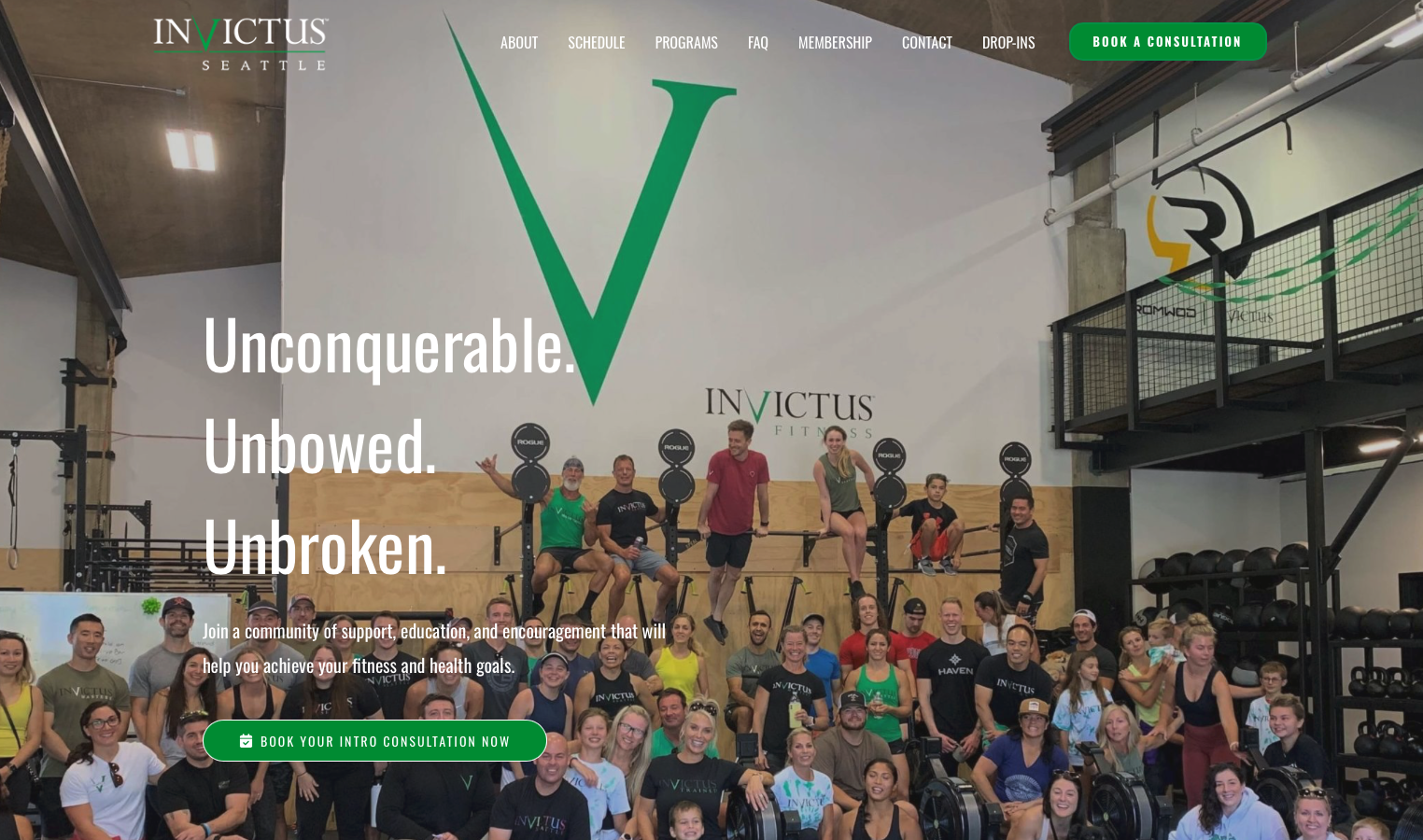
Crossfit Invictus Seattle's website embodies the resilience and strength that the brand name suggests. "Invictus" – Latin for "unconquerable" – sets the tone for a fitness philosophy centered on mental and physical fortitude. The site successfully communicates a holistic approach to fitness that extends beyond just physical training.
Strong Brand Elements
Powerful Tagline: "Unconquerable. Unbowed. Unbroken." This three-part mantra immediately communicates the brand ethos of resilience and strength. The poetic quality of the messaging elevates the gym beyond typical CrossFit marketing and creates emotional resonance with prospects seeking personal transformation.
Holistic Service Framework: Rather than just listing "CrossFit classes," the site presents four key benefit areas: Weight Control, Discipline, Nutrition, and Structure. This framework positions Invictus as offering comprehensive lifestyle transformation, not just workouts. Each pillar is explained with concise, benefit-driven language that addresses deeper motivations.
Community-Focused Messaging: The site emphasizes transformational aspects of the fitness journey and community support. For CrossFit gyms where community culture is a primary differentiator, this messaging is essential and well-executed.
Clear Onboarding Process: The three-step onboarding process is clearly outlined, making the path to membership transparent. This reduces anxiety about "what happens next" and makes the first step feel manageable. The emphasis on personalized coaching differentiates from generic group fitness.
Strategic Color Scheme: The green and white color palette suggests growth, health, and freshness while maintaining high contrast for readability. The colors align with the holistic wellness positioning.
Mobile Responsive Design: The site demonstrates responsive menu design and simplified layouts for smaller screens, ensuring the experience works across devices. Given that gym prospects often browse during or after workouts on mobile, this is essential.
Areas Needing Development
Limited Social Proof: While community is emphasized conceptually, the site lacks specific client testimonials, transformation stories, or member quotes. Concrete examples of lives changed would strengthen the emotional case for joining.
Visual Diversity: The site could benefit from more varied, dynamic imagery showing actual training sessions, community events, and the energy of the gym environment. Prospective members want to visualize themselves in the space.
Coach Visibility: More prominent coach profiles with credentials, specializations, and personalities would help prospects connect with the human element. People join gyms as much for the coaching relationships as the programming.
Interactive Engagement: Beyond the consultation booking, adding interactive elements like fitness assessments, goal-setting tools, or community event calendars could increase time on site and emotional investment before the first visit.
Pricing Transparency: No pricing information is visible, requiring prospects to book consultations just to learn costs. While this ensures sales conversations, it can frustrate prospects who want to quickly qualify themselves based on budget.
Key Takeaway: Invictus Fitness Seattle demonstrates how CrossFit gyms can differentiate through philosophical positioning and holistic programming presentation. The powerful brand messaging and clear onboarding process create a strong foundation, but the site would benefit significantly from enhanced social proof, visual diversity, and coach visibility. For CrossFit and group fitness businesses, this example shows the importance of communicating community culture and comprehensive programming beyond just "we do workouts."
Example 14: FitScript
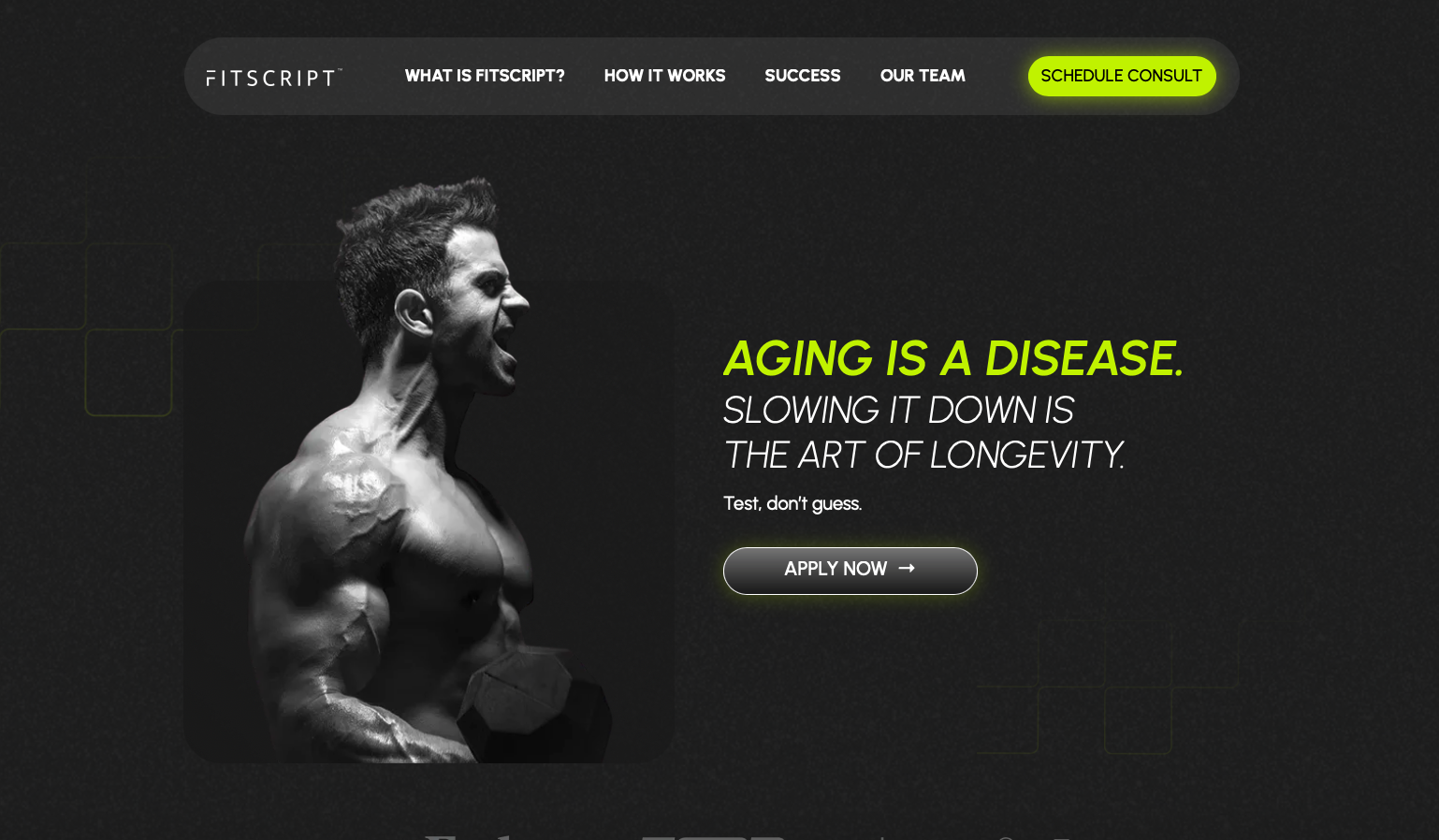
FitScript represents the emerging intersection of fitness and medical wellness – a health optimization platform that treats "aging as a disease" and positions longevity as an achievable art through scientific intervention. With comprehensive biomarker testing (124+ markers), personalized medical team support, and a data-driven approach, FitScript targets affluent clients seeking premium health optimization rather than traditional personal training.
Exceptional Strategic Positioning
Provocative Value Proposition: "Aging is a disease. Slowing it down is the art of longevity." This bold positioning immediately differentiates FitScript from traditional fitness services. By framing aging as something to combat medically rather than accept, the site appeals to high-achieving individuals who approach health optimization with the same intensity they bring to their careers.
Sophisticated Design Execution: The modern, minimalist layout with bold typography and abundant white space communicates medical precision and premium positioning. The clean aesthetic suggests scientific rigor rather than fitness industry hype. This design language is perfect for attracting educated, high-net-worth individuals.
Transparent Pricing and Comparison: The site includes detailed comparison charts showing how FitScript stacks up against competitors, highlighting unique advantages like comprehensive biomarker testing and personalized medical teams. This transparency demonstrates confidence and helps justify premium pricing through clear differentiation.
Impressive Social Proof: A 4.8/5 rating from 150+ users provides credibility, while extensive client transformation images demonstrate real-world effectiveness. For a medical/scientific service, this volume of positive feedback addresses skepticism about whether the premium investment delivers results.
Clear Service Breakdown: The detailed explanation of biomarker testing, health optimization roadmaps, and personalized medical team support helps prospects understand exactly what they're investing in. Visual icons and concise descriptions make complex medical concepts accessible.
Strong Call-to-Action Strategy: "Apply now" buttons throughout create exclusivity – you don't just "sign up," you apply to be accepted. This positioning increases perceived value and attracts clients who see themselves as high-performers seeking elite services.
Mobile Optimization: Responsive design elements ensure the sophisticated experience translates to mobile devices, essential for the target demographic of busy professionals who browse on phones between meetings.
Considerations and Improvements
Information Density: Some sections present dense scientific information that, while valuable for the target market, could be broken into more scannable formats with bullet points, pull quotes, or visual callouts. Even highly educated prospects benefit from information hierarchy.
Coach/Doctor Profiles: While the personalized medical team is mentioned, showcasing specific doctors, nutritionists, and coaches with their credentials would strengthen trust. High-paying clients want to know exactly who they'll work with.
Success Metric Details: Beyond transformation photos, including specific health marker improvements (cholesterol reduction, hormone optimization, metabolic improvements) would provide concrete evidence of the program's medical effectiveness.
Interactive Engagement: Adding interactive tools like health risk assessments, biomarker calculators, or longevity estimators could increase engagement and help prospects self-identify whether they're candidates for the service.
Pricing Transparency: While the service is clearly premium, providing more specific pricing information or at least ranges would help qualify leads. Given the comprehensive medical nature of the service, transparency about investment level would streamline consultations.
Key Takeaway: FitScript exemplifies how to position at the premium end of the health and fitness market by bridging into medical optimization. The provocative positioning, sophisticated design, comprehensive service explanation, and strong social proof create a compelling case for affluent clients seeking data-driven longevity solutions. For fitness professionals with medical credentials or partnerships, this model demonstrates how to transcend traditional training commoditization by offering measurable health optimization with medical oversight. The key is combining scientific credibility with clear differentiation and results documentation.
Example 15: Mark Fisher Fitness
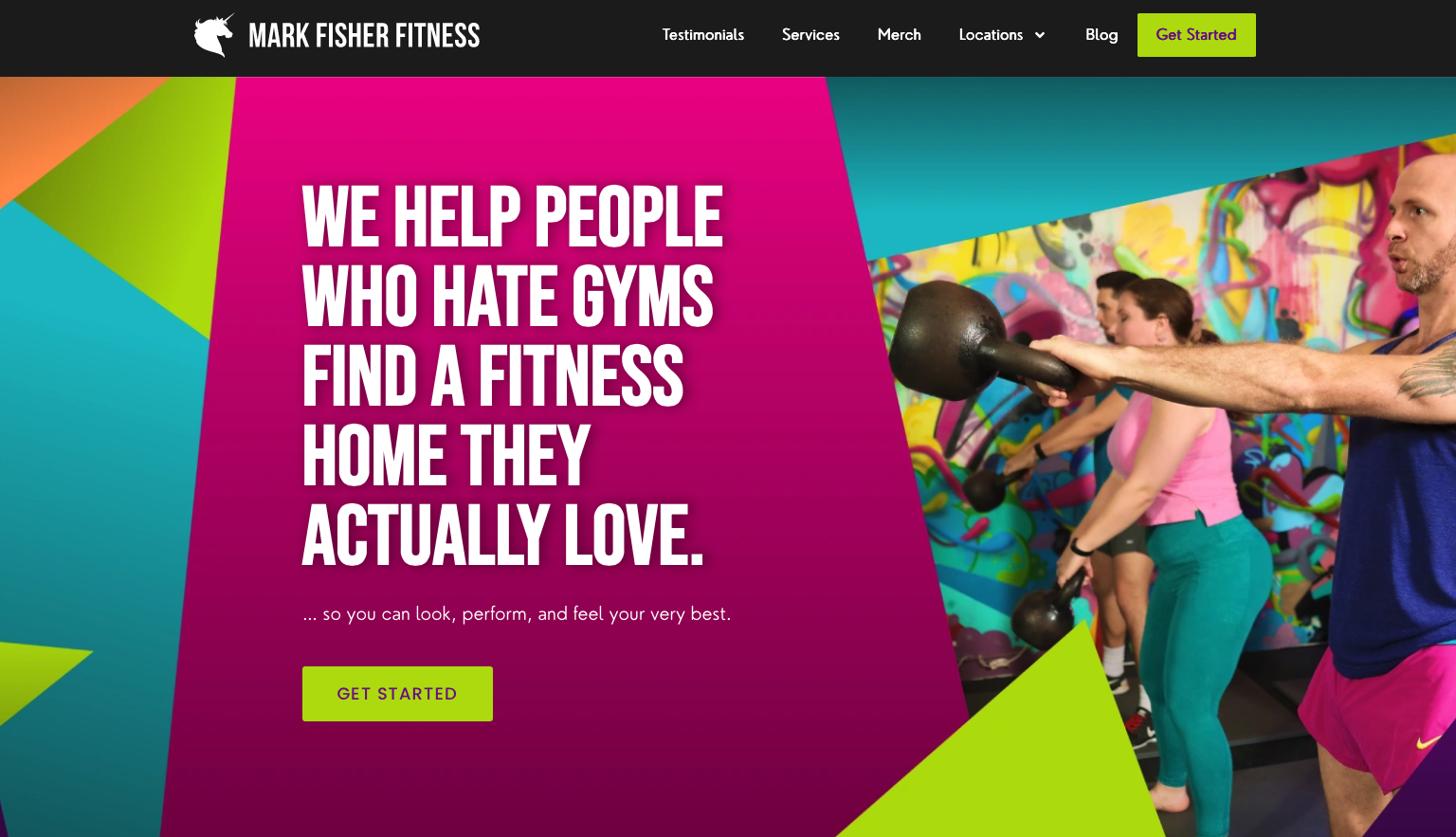
Mark Fisher Fitness (MFF) represents one of the most distinctive and personality-driven fitness brands in the industry. Dubbing itself the "Enchanted Ninja Clubhouse of Glory and Dreams," MFF has built a cult following by rejecting traditional gym culture and creating an inclusive, playful, yet results-focused training environment. The website perfectly embodies this unique brand personality.
Brilliant Brand Differentiation
Perfect Target Market Messaging: "WE HELP PEOPLE WHO HATE GYMS FIND A FITNESS HOME THEY ACTUALLY LOVE." This headline is marketing genius – it immediately speaks to gym-phobic individuals who've tried traditional fitness and failed. By acknowledging gym hatred rather than dismissing it, MFF creates instant connection with an underserved market segment.
Bold Visual Identity: The vibrant color palette – bright green (#B5DF0D), deep purple (#730A8D), and hot pink (#EC008C) – creates immediate visual impact and signals that this gym is fundamentally different from typical fitness clubs. The high-energy colors match the brand's playful personality and stand out dramatically in a sea of black-and-gray fitness marketing.
Authentic Community Showcasing: The hero image and throughout the site feature diverse members of all body types engaged in training, creating inclusive representation. This visual diversity communicates that MFF is genuinely welcoming to everyone, not just already-fit individuals. For gym-phobic prospects, this representation is crucial.
Distinctive Brand Language: From "Enchanted Ninja Clubhouse" to the playful yet professional copy throughout, the language creates a unique brand voice that attracts the right people while repelling those who wouldn't fit the culture. This self-selection through personality is smart positioning.
Clear Service Differentiation: The two main offerings – Small Group Personal Training and Group Classes – are presented with concise, benefit-focused descriptions. The emphasis on personalization within group settings addresses the common objection that group fitness can't be customized.
Professional Design Execution: Despite the playful branding, the design execution is highly professional with clean layouts, responsive mobile design, and intuitive navigation. This combination – fun personality, serious results – is what makes MFF work.
Impressive Credibility Markers: Features in The New York Times and Wall Street Journal provide mainstream validation that MFF's unconventional approach is legitimate and effective. This third-party credibility is essential for prospects wondering if "fun" can coexist with results.
Multiple Conversion Pathways: Prominent "Get Started" buttons, popup forms, and a clear three-step onboarding process make it easy for interested prospects to take action. The conversion architecture is sophisticated despite the playful aesthetic.
Opportunities for Enhancement
Pricing Information: Like many boutique fitness facilities, MFF doesn't display pricing upfront. While this encourages consultation calls, some prospects who are price-conscious may bounce without engaging. Even rough ranges could improve lead quality.
Results Documentation: While community and culture are front and center, more prominent transformation stories with specific results would strengthen the case that MFF delivers physical outcomes alongside emotional benefits.
Coach Spotlights: Showcasing more individual trainers with their personalities, specializations, and training philosophies would help prospects find personal connections. Given MFF's emphasis on community, the human element should be even more prominent.
Program Details: More specific information about programming methodology, workout styles, and progression systems would help serious fitness enthusiasts understand what makes MFF's approach effective beyond just being fun.
Key Takeaway: Mark Fisher Fitness demonstrates that distinctive personality and authentic brand voice can be powerful differentiators in a crowded market. By targeting "people who hate gyms" rather than fitness enthusiasts, MFF carved out an underserved niche and built a devoted community. The lesson for fitness professionals: don't try to appeal to everyone. Instead, develop a strong point of view, embrace personality over polish, and attract people who resonate with your authentic approach while naturally repelling those who don't. The combination of playful branding with professional execution and mainstream media validation creates a unique positioning that commands premium pricing and fierce customer loyalty.
Example 16: Shaun Stafford Fitness
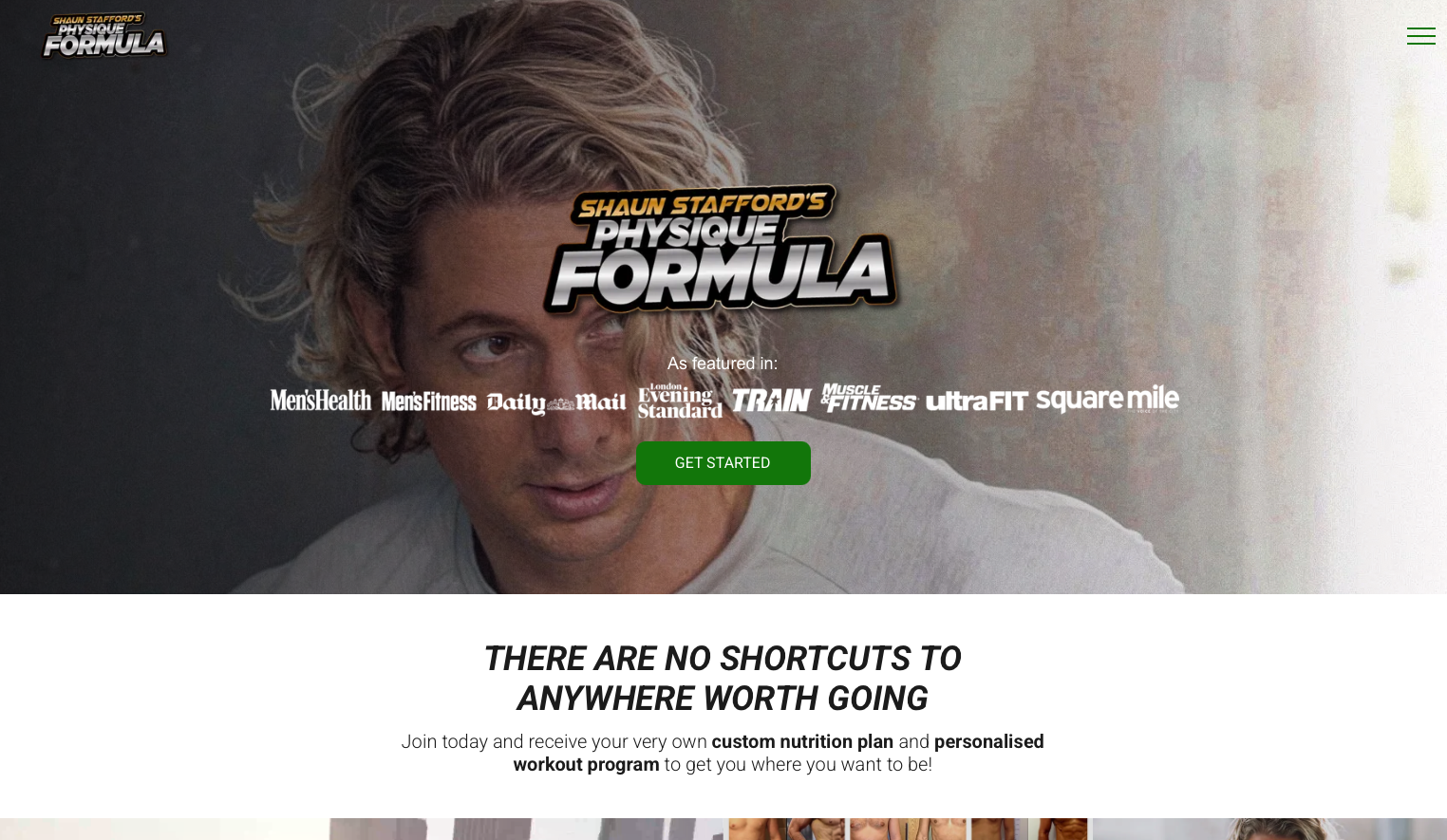
Shaun Stafford Fitness presents an interesting case where website access limitations prevented full analysis. The site returned a 403 error during our review, which ironically provides an important lesson about website accessibility and technical maintenance.
The Technical Accessibility Lesson
Website Availability is Critical: When potential clients can't access your website due to technical issues, server blocks, or security configurations, you're losing business. Every minute your site is inaccessible represents lost opportunities – prospects who might have become clients simply move to competitors whose sites work.
Security vs. Accessibility Balance: While security measures are important, overly restrictive access controls can prevent legitimate visitors from viewing your site. The 403 error (Forbidden) typically indicates server-level restrictions that may be blocking legitimate traffic along with potential threats.
Mobile and Geographic Accessibility: Fitness professionals serve clients across devices, locations, and networks. Ensuring your site is accessible from mobile networks, public WiFi, VPNs, and international locations is crucial for maximum reach.
Best Practices for Website Availability
Regular Monitoring: Implement uptime monitoring services that alert you immediately when your site becomes inaccessible. Services like UptimeRobot or Pingdom can notify you of issues before you lose significant traffic.
Hosting Quality: Invest in reliable hosting from reputable providers. Budget hosting can save money initially but cost far more in lost clients through downtime and performance issues.
Security Configuration Review: Work with your hosting provider or developer to ensure security measures don't inadvertently block legitimate visitors. Proper configuration can maintain security while ensuring accessibility.
Testing Across Conditions: Regularly test your site from different devices, browsers, locations, and networks to identify accessibility issues before prospects encounter them.
Error Page Optimization: When technical issues occur, ensure error pages provide alternative contact methods (phone, email, social media) so interested prospects can still reach you.
Key Takeaway: While we couldn't review Shaun Stafford Fitness's actual content and design, the accessibility issue provides an important reminder: the best website design in the world is worthless if prospects can't access it. Technical reliability, proper security configuration, and consistent availability are foundational requirements that must be addressed before focusing on design aesthetics or conversion optimization. For fitness professionals, ensure your site is always accessible, mobile-friendly, and performant across all conditions. Consider this a prerequisite for all other website best practices.
Key Best Practices for Personal Trainer Websites
After analyzing these sixteen examples, several universal best practices emerge that any personal trainer can apply to their website:
1. Lead With Transformation, Not Training
The most effective personal trainer websites focus on the outcomes clients want – feeling confident, getting stronger, losing weight, building healthy habits – rather than listing services. Your homepage hero should answer: "What will my life look like after working with you?"
2. Show Real Results
Social proof is absolutely critical in the fitness industry. Before/after photos, client testimonials, and transformation stories provide the evidence that your methods work. Make these prominent, not buried on a separate page.
3. Reflect Your Unique Personality
Generic fitness websites don't convert. Whether your approach is intense and athletic (like Joey Fowler), gentle and empathetic (like Jessica Manning), or empowering and transformational (like Ascend by Ada), your site should reflect who you are and how you train.
4. Make Booking Frictionless
Every website featured here makes it dead simple to take the next step. Whether it's a free consultation, trial session, or program sign-up, the path to becoming a client is clear and easy. Don't make potential clients hunt for contact information or figure out how to get started.
5. Mobile Optimization Is Non-Negotiable
More than 60% of fitness website traffic comes from mobile devices. If your site doesn't look great and function perfectly on phones, you're losing more than half your potential clients. Every example here prioritizes mobile experience.
6. Use Strategic Calls-to-Action
Don't rely on a single "Contact Me" button in your header. Effective trainer websites include CTAs throughout the page, at natural decision points. After reading about your services, seeing transformation stories, or learning about your credentials, give visitors an immediate way to act on their interest.
7. Establish Credibility Quickly
Display your certifications, credentials, and experience prominently. For new visitors who don't know you, these trust signals are crucial. If you have specialized certifications or have worked with notable clients, make that visible early.
8. Reduce Perceived Risk
Offering something like a free consultation, trial session, or money-back guarantee (like Ascend by Ada does) dramatically lowers the barrier to trying your services. Many potential clients want to work with a trainer but are nervous about committing – risk reversal strategies help them take that first step.
The Bottom Line: Your personal trainer website should do three things exceptionally well: build emotional connection, establish credibility, and make it easy to become a client. Master these fundamentals, and you'll convert more visitors into paying clients than 90% of your competitors.
Ready to Build Your Personal Trainer Website?
Creating an effective personal trainer website doesn't have to be complicated or expensive. Whether you work with a professional designer or build it yourself, focusing on these core principles will set you apart from competitors. For a broader look at getting your fitness business online, read our online presence guide.
At Vibe Otter, we specialize in creating conversion-focused websites for personal trainers and fitness professionals. We've built dozens of sites in this industry and understand exactly what converts visitors into clients.
The fitness industry is more competitive than ever. Your website is your 24/7 salesperson, working to attract and convert clients even when you're training, sleeping, or taking time off. Invest in making it great, and it will pay dividends for years to come.
Next Steps: If you're ready to create or redesign your personal trainer website, start by auditing your current site (or your competitors' sites) against the principles in this article. Identify what's working, what's missing, and what opportunities exist to better showcase your unique value.
Stay in the Loop
Get the latest insights on web design, fitness marketing, and growing your personal training business delivered straight to your inbox.
No spam, ever. Unsubscribe anytime.
Ready to Create Your Website?
Start building your personal trainer website today with Vibe Otter's expert design services.