October 13, 2025 • 18 min read • By Nick Rackley
Daycare Websites: Best Practices With Examples (2025)
As a daycare or childcare center owner, your website is far more than just a digital brochure – it's the first impression that determines whether anxious parents trust you with their most precious responsibility: their children. In an industry built entirely on trust, safety, and developmental outcomes, your website must communicate professionalism, expertise, and genuine care from the very first click.
At Vibe Otter Web Design, we've helped numerous childcare centers transform their online presence into powerful enrollment engines. Having a strong online presence for small businesses is essential in the childcare industry, and daycare websites face a unique challenge: they must appeal to decision-making parents while showcasing a nurturing environment for children. In this comprehensive guide, we'll analyze 8 exceptional daycare websites that have mastered this delicate balance.
You'll discover exactly what makes each of these websites effective, and more importantly, how you can apply these proven principles to increase enrollments at your own childcare center.
Why This Matters: The childcare industry is increasingly competitive, with parents researching extensively before making enrollment decisions. A professional, conversion-optimized website can increase your enrollment inquiries by 300% or more. The difference between a fully-enrolled center with a waiting list and one struggling to fill spots often comes down to digital first impressions.
The Critical Mistake: Marketing to Kids Instead of Parents
⚠️ Parents Make the Decisions, Not Children
Here's the hard truth: Your website isn't for the kids. It's for their parents.
Yet one of the most damaging mistakes in daycare web design is creating sites that look designed for children—bright primary colors everywhere, cartoon characters, Comic Sans fonts, busy animations.
When your website looks like Chuck E. Cheese, you're saying:
- Play over education
- Chaos over structure
- Entertainment over development
Parents researching childcare need answers to serious questions: "Will my child be safe? Will they actually learn? Are the staff qualified?"
A cartoonish website undermines every answer before you can give it.
What Works Instead:
The best daycare websites balance warmth with professionalism—authentic photos of happy children learning, combined with clean design that looks like a respected educational institution.
The Bottom Line: Your website should look like a preschool or elementary school, not a theme park. Professional design converts. Cartoons don't.
Example 1: Evergreen Academy
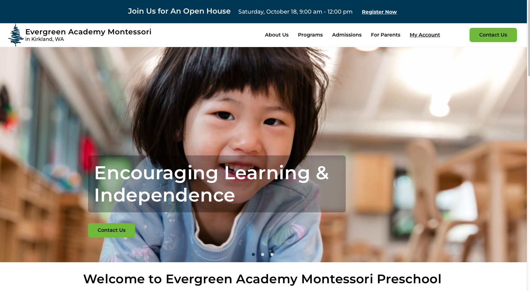
Evergreen Academy's website exemplifies professional, parent-focused design in the childcare space. Located in the Seattle suburbs, this Montessori-inspired center has created a digital presence that immediately communicates educational excellence and developmental expertise.
What Works Exceptionally Well
Sophisticated, Academic Visual Identity: The site employs a refined color palette of deep blues and soft greens that convey trust, growth, and professionalism. This isn't a playroom – it's a learning environment. The muted, sophisticated tones immediately position Evergreen Academy as an educational institution rather than simple childcare.
Montessori Methodology Emphasis: The site prominently features their Montessori-inspired approach, which resonates with education-focused parents seeking proven developmental frameworks. This clear educational philosophy differentiates them from generic daycare options.
High-Quality Authentic Photography: Rather than stock photos or cartoons, the site showcases real children engaged in meaningful learning activities. These warm, professional images help parents envision their own children thriving in this environment while maintaining an academic tone.
Clear Program Communication: From preschool through elementary school programs, the site clearly articulates age-appropriate offerings and summer camp options. This comprehensive approach increases lifetime value by positioning Evergreen as a long-term educational partner.
Teacher Qualification Transparency: The emphasis on qualified educators and parent communication addresses core parental concerns about safety, expertise, and engagement. This transparency builds immediate trust.
Mobile-Responsive Excellence: The site adapts flawlessly to all devices, ensuring busy parents can research on their phones during lunch breaks or commutes without frustration.
Areas for Potential Improvement
Text Density: Some pages contain substantial text that could be broken up with more subheadings, bullet points, or visual elements to improve scannability for time-pressed parents.
Interactive Elements: Adding virtual tour features or short video testimonials could provide additional engagement opportunities for deeply interested prospects.
Key Takeaway: Evergreen Academy demonstrates that sophisticated design and educational positioning attract quality-conscious parents willing to invest in their children's early development. By avoiding cartoonish design elements and instead focusing on academic credibility, they appeal to their ideal demographic: parents seeking more than just supervision.
Example 2: Everbrook Academy
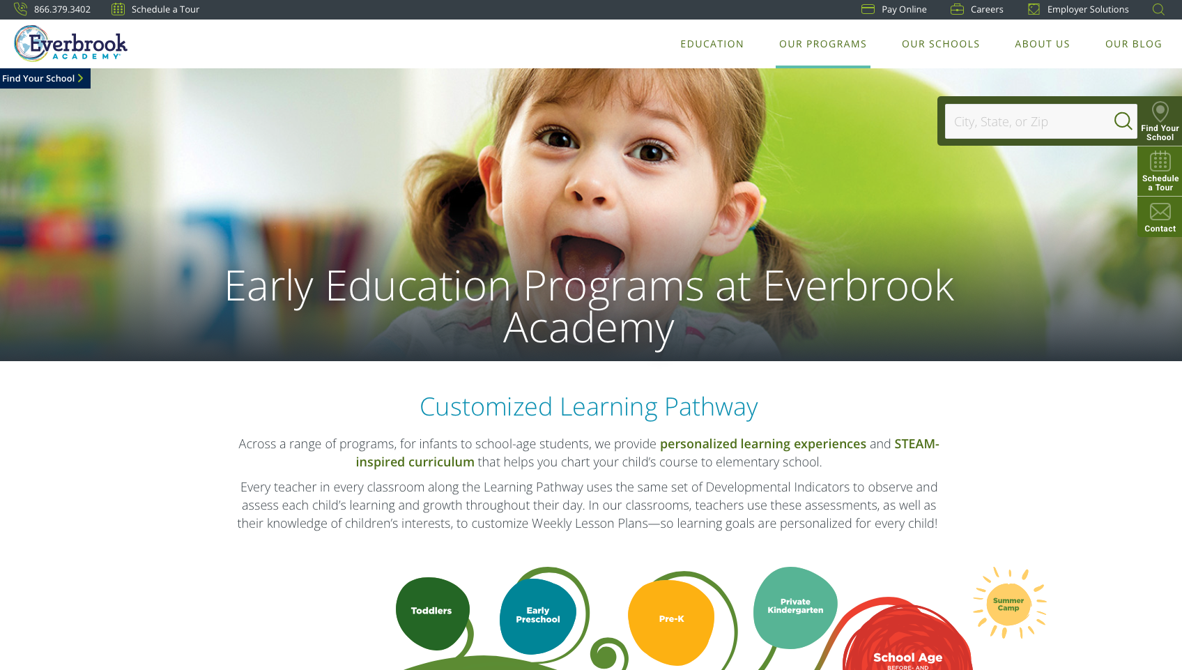
Everbrook Academy represents the cutting edge of modern childcare web design, seamlessly blending educational excellence with technological innovation. Their website succeeds by positioning them as a forward-thinking institution that leverages technology to enhance both learning and parent communication.
What Makes It Outstanding
STEAM Curriculum Leadership: The prominent emphasis on STEAM (Science, Technology, Engineering, Arts, Mathematics) education immediately signals to parents that this center prioritizes future-ready skills and comprehensive development. This positioning attracts educated, career-focused parents seeking more than traditional daycare.
Technology Integration as Differentiator: The SproutAbout parent communication app and classroom live streaming features address modern parents' desire for constant connection and transparency. These technological features transform anxiety into confidence by providing real-time insights into their child's day.
Professional, Trustworthy Design: The clean blue and white color scheme with approachable typography creates a balance between academic professionalism and warmth. The design communicates "serious about education" without feeling cold or institutional.
Comprehensive Age-Specific Programming: From infants through pre-K, the site clearly delineates developmental approaches for each age group. This specificity reassures parents that their child's unique developmental stage will be appropriately supported.
Flexible Enrollment Messaging: Highlighting part-time scheduling options removes a common barrier for parents who need quality care but not full-time enrollment. This flexibility expands their addressable market significantly.
Clear Value Proposition: The site succinctly communicates educational benefits and developmental outcomes, making it easy for parents to understand exactly what makes Everbrook different and worth the investment.
Areas for Potential Improvement
Information Architecture: The homepage contains multiple messaging sections that, while comprehensive, could potentially overwhelm first-time visitors. Streamlining the initial experience while maintaining depth on secondary pages could improve conversion.
Visual Hierarchy: Some content sections compete for attention. Establishing clearer priority between primary CTAs (schedule tour, enroll) and secondary information could guide visitors more effectively through the decision journey.
Key Takeaway: Everbrook Academy proves that technology and innovation can be powerful differentiators in childcare marketing. By showcasing classroom streaming, communication apps, and STEAM curriculum, they position themselves as a modern educational institution that appeals to tech-savvy, career-focused parents seeking the best developmental outcomes for their children.
Example 3: My Little Universe LLC
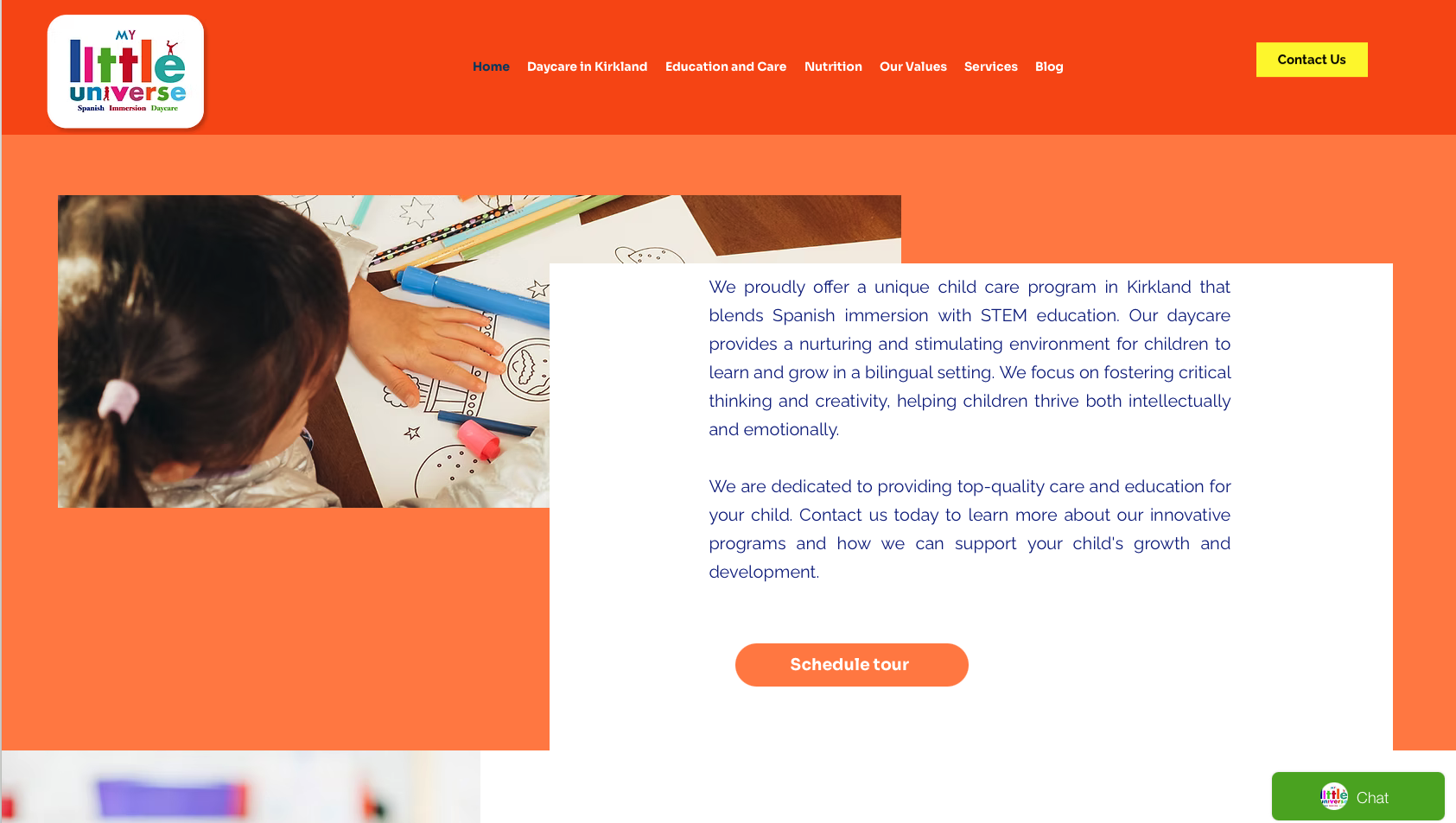
My Little Universe LLC in Kirkland, Washington takes a decidedly minimalist, corporate-professional approach to childcare web design. This site demonstrates that sometimes restraint and simplicity can be highly effective, particularly when targeting professional parents who value organization and clarity.
What Works Well
Ultra-Clean, Professional Aesthetic: The site employs soft professional blues and neutral tones with clean, modern sans-serif typography. This minimalist approach creates an immediate impression of organization, structure, and professional management.
Corporate Professional Positioning: The design deliberately feels more like a professional services firm than a traditional daycare. This positioning appeals to career-focused parents who want their childcare to reflect their own professional values and standards.
Mobile-Responsive Architecture: The simple, clean layout translates perfectly to mobile devices, ensuring busy professionals can quickly find essential information without navigation frustration.
Structured Information Presentation: Navigation is logical and straightforward, allowing parents to quickly locate programs, policies, and contact information without excessive clicking or searching.
Reliability Communication: The sleek, organized design itself communicates reliability and attention to detail – essential qualities parents seek in childcare providers.
Areas for Potential Improvement
Emotional Connection: While the professional design builds trust, it may lack the warmth and emotional resonance that helps parents envision the nurturing environment their child will experience. Adding more imagery of children and caregivers could create better emotional balance.
Environmental Transparency: Limited visual representation of the actual facility and learning spaces may leave some parents wanting more concrete evidence of the physical environment.
Warmth and Nurturing Indicators: The potentially overly corporate aesthetic might feel cold to some parents seeking a balance between professionalism and warmth. Strategic addition of authentic photos could soften this impression.
Key Takeaway: My Little Universe demonstrates that minimalist, corporate-professional design can effectively position a childcare center as organized, structured, and professionally managed. This approach particularly resonates with busy professionals who value efficiency and systems. However, balancing this professional aesthetic with warmth and nurturing indicators remains important to address the full spectrum of parental concerns.
Example 4: Greenpoint Childcare
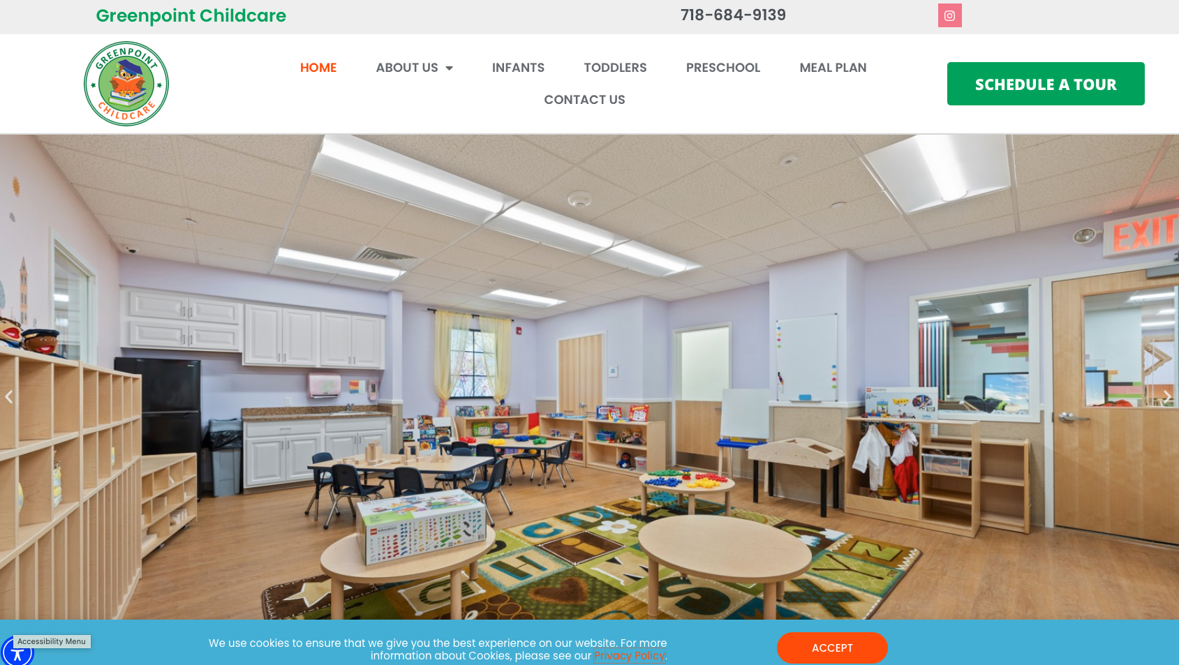
Greenpoint Childcare's website beautifully demonstrates how Montessori educational principles can be reflected in web design itself. The clean, intentional layout mirrors the Montessori emphasis on order, purpose, and thoughtful design, creating immediate alignment between their educational philosophy and digital presence.
Design Excellence
Montessori-Aligned Visual Design: The site's clean, organized aesthetic with prominent green (#04d171) and neutral tones mirrors Montessori principles of order, natural elements, and purposeful design. This creates subconscious alignment between the website experience and the educational approach parents can expect.
Educational Credibility Front and Center: The site immediately highlights their Montessori-based curriculum and developmental approach. For parents familiar with Montessori methodology, this signals a proven, respected educational framework rather than ad-hoc programming.
Professional, Academic Positioning: The clean typography (Roboto-style fonts) and modern layout positions Greenpoint as an academic institution focused on early childhood education, not merely supervision or entertainment.
Comprehensive Program Transparency: Age-specific programs from infants through preschool are clearly articulated, helping parents understand exactly how their child's developmental stage will be supported with appropriate activities and learning objectives.
Nutritional Meal Planning Emphasis: Highlighting nutritional planning addresses a key parental concern and differentiates Greenpoint from facilities that rely on less thoughtful meal approaches.
Staff Expertise Communication: Emphasis on qualified educators and Montessori training reassures parents that their children will be guided by knowledgeable professionals, not just babysitters.
Areas for Potential Improvement
Text-Heavy Presentation: Some sections contain substantial text that could benefit from breaking into shorter paragraphs, bullet points, or visual elements to improve scannability for busy parents.
Visual Engagement: While the professional aesthetic is effective, adding more dynamic visual elements or authentic photography could increase emotional engagement and help parents visualize the environment.
Child-Centric Imagery: More photographs of actual children engaged in Montessori activities could strengthen the emotional connection while maintaining the professional tone.
Key Takeaway: Greenpoint Childcare demonstrates the power of alignment between educational philosophy and web design. By creating a digital experience that mirrors Montessori principles of order, intentionality, and natural beauty, they create subconscious confidence in parents that the same thoughtful approach extends to their children's daily care and education.
Example 5: Jumpstart Quality Childcare
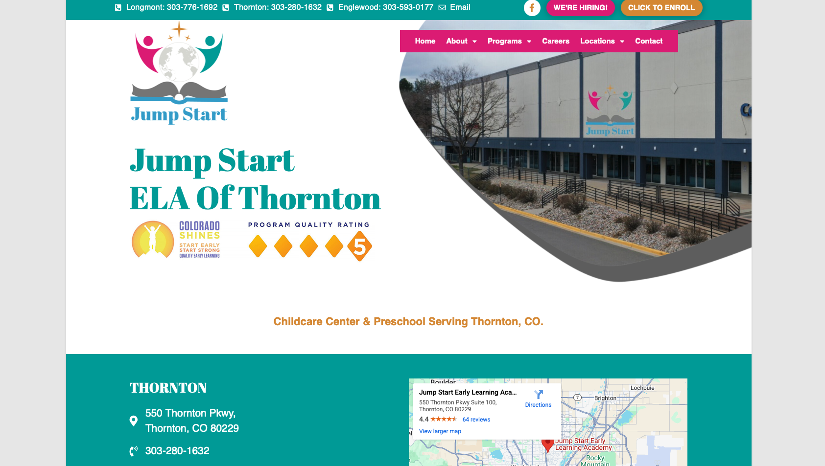
Jumpstart Quality Childcare's website excels at comprehensive transparency – addressing virtually every question or concern a researching parent might have. This thoroughness builds exceptional trust by demonstrating nothing is hidden and every aspect of care is thoughtfully designed.
What Makes It Effective
Comprehensive Transparency Strategy: The site provides detailed information about age-appropriate learning centers, curriculum approaches, special needs support, health screenings, meals, playgrounds, and more. This exhaustive transparency eliminates uncertainty and builds confidence that Jumpstart has considered every detail of quality care.
Professional Color Palette: Soft teal (#00b6b5) accents with orange, pink, and blue create visual interest while maintaining professional credibility. The colors feel warm and inviting without becoming cartoonish or chaotic.
Bilingual Programming Highlight: Emphasizing bilingual language encouragement positions Jumpstart as forward-thinking and addressing the desires of modern parents who want their children exposed to multiple languages early.
Special Needs Inclusivity: Prominently featuring special needs support communicates inclusivity and expertise, expanding their addressable market while demonstrating genuine commitment to serving all children.
Health and Safety Emphasis: On-site vision and hearing screenings demonstrate proactive health monitoring that goes beyond basic care requirements. This extra mile approach differentiates Jumpstart from minimal-compliance competitors.
Homemade Meals Messaging: Highlighting homemade, nutritious meals addresses parental concerns about nutrition and demonstrates care quality extends to every aspect of the child's day.
Technology Integration: Daily parent updates via app and transportation services address practical parental needs, making Jumpstart not just educational but genuinely convenient for busy families.
Areas for Potential Improvement
Content Organization: The comprehensive approach creates text-heavy pages that could benefit from better organization through tabs, accordions, or progressive disclosure to prevent overwhelming first-time visitors.
Visual Balance: More strategic use of white space and visual hierarchy could help parents process the substantial information more easily.
Page Load Optimization: The image-heavy design might benefit from optimization to ensure fast loading across all devices and connection speeds.
Key Takeaway: Jumpstart Quality Childcare proves that comprehensive transparency can be a powerful conversion tool. By addressing virtually every conceivable parental question and concern upfront, they build exceptional trust and position themselves as having nothing to hide. This approach particularly resonates with detail-oriented, research-focused parents who want complete information before making decisions about their children's care.
Example 6: KidsPark
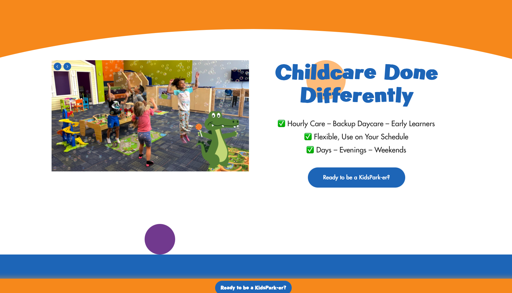
KidsPark has created a website that brilliantly addresses a specific, underserved market need: flexible, drop-in childcare for busy parents who don't need full-time enrollment. Their site succeeds by clearly communicating convenience and flexibility while maintaining educational credibility.
What Works Exceptionally Well
Unique Value Proposition Front and Center: "No reservation required" and "Drop-in care" messaging immediately differentiates KidsPark from traditional daycare centers. This unique positioning attracts parents frustrated by rigid schedules and waiting lists at conventional facilities.
Flexibility as Core Differentiator: Highlighting days, evenings, and weekend availability addresses a massive pain point for parents with non-traditional work schedules, single parents, or those needing occasional reliable care for appointments or date nights.
Professional, Corporate Aesthetic: The blue (#2170bf) and orange (#F8A03F) color scheme with clean Futura-Medium typography creates a professional, trustworthy appearance that reassures parents this isn't chaotic drop-in babysitting but structured, quality care.
Educational Enrichment Emphasis: Despite the flexible model, the site prominently features structured activities including art, STEAM, and fitness programs. This combination of convenience AND education addresses the concern that flexible care might mean lower quality.
Staff Qualification Transparency: Clear communication about educator backgrounds and qualifications addresses the natural skepticism parents might have about drop-in care quality compared to traditional daycare.
Multi-Location Network: Showcasing locations across the US creates credibility through scale and provides convenience for families who travel or relocate.
Inclusive, Warm Photography: The site features diverse, authentic images of children and caring staff that build emotional connection while maintaining professional presentation.
Areas for Potential Improvement
Location Overwhelm: The extensive number of locations, while impressive, could potentially overwhelm visitors. A location-finder feature or geographic organization could simplify discovery.
Pricing Transparency: More prominent pricing information could help parents quickly determine if KidsPark fits their budget without requiring contact or deep navigation.
Homepage Visual Complexity: Simplifying the initial visual experience could help visitors more quickly grasp the core value proposition before exploring details.
Key Takeaway: KidsPark demonstrates the power of positioning around an underserved need. By building their entire brand and website around flexibility and convenience while maintaining educational credibility, they attract parents frustrated by traditional daycare rigidity. Their site succeeds because it immediately answers the question "How is this different?" and maintains that differentiation throughout every page.
Example 7: La Petite Academy
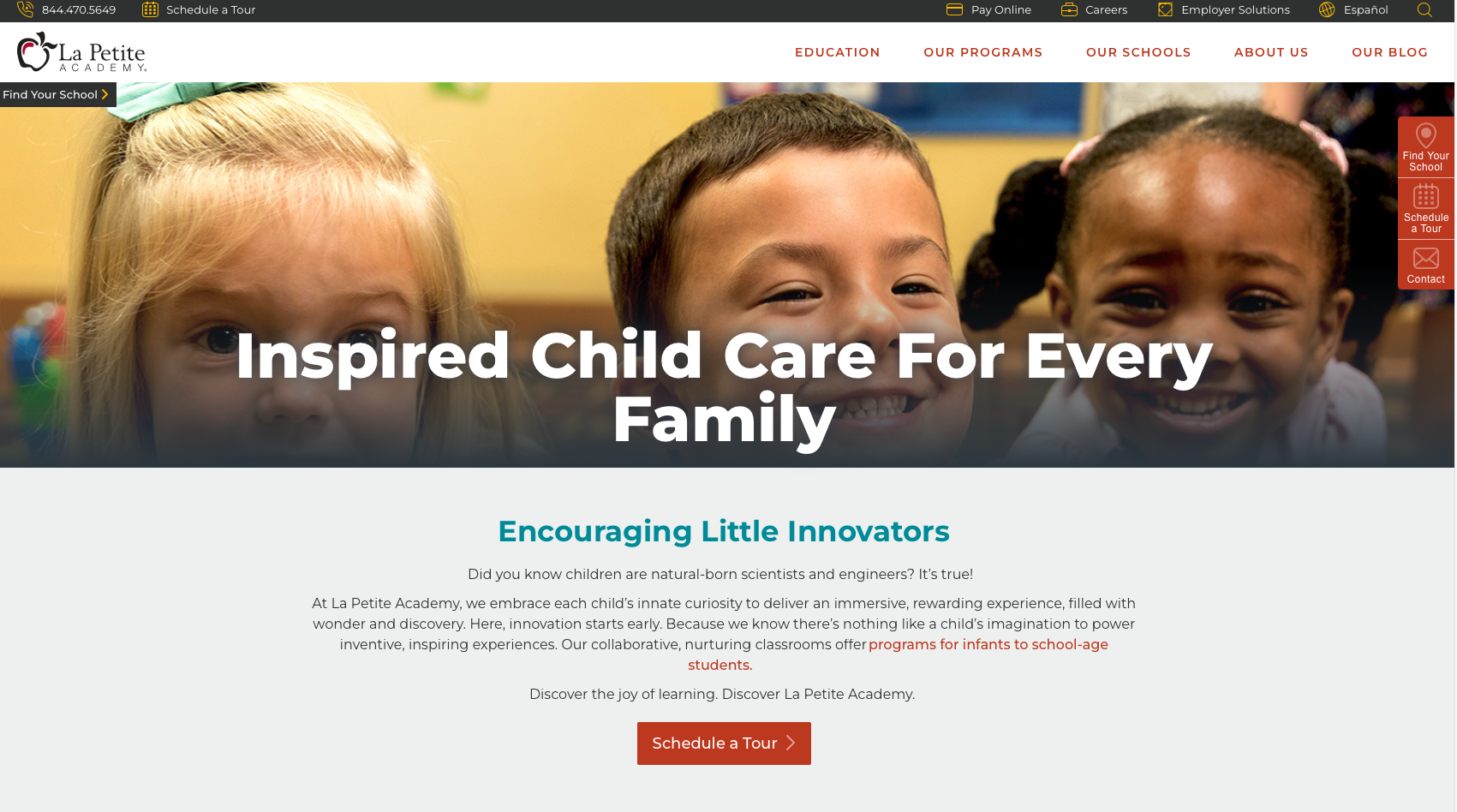
La Petite Academy's website represents enterprise-level childcare web design done right. As a national chain, they face the challenge of conveying both the credibility of scale and the warmth of local care. Their site succeeds by emphasizing measurable educational outcomes alongside convenience and professionalism.
What Makes It Outstanding
Data-Driven Credibility: The prominent statistic "Over 90% show mastery of kindergarten skills" provides concrete, measurable evidence of educational effectiveness. This data-driven approach appeals to results-oriented parents who want proof, not just promises.
Comprehensive Age-Based Programming: Clear delineation of programs by developmental stage (infant, toddler, preschool, pre-K) with specific educational approaches demonstrates expertise in age-appropriate development rather than one-size-fits-all care.
Clean, Professional Design: The site employs professional blues, whites, and neutral tones with clean sans-serif typography that communicates trust and educational seriousness. This corporate-professional aesthetic reassures parents they're choosing an established, reputable institution.
Technology Integration: The family communication app provides the real-time updates and connection modern parents expect, addressing anxiety about what happens during the day while building ongoing engagement.
Kindergarten Preparation Focus: Emphasizing kindergarten readiness positions La Petite as truly educational rather than merely supervisory. This resonates with parents viewing early childhood as foundational to long-term academic success.
Flexible Care Options: Highlighting summer camp and various enrollment options expands their addressable market beyond traditional full-time care.
Online Tour Scheduling: Easy virtual tour scheduling removes friction from the research process, converting interested visitors into qualified leads efficiently.
Areas for Potential Improvement
Information Density: The comprehensive approach creates information-heavy pages that might overwhelm parents in initial research stages. Progressive disclosure or simplified entry points could improve first-time visitor experience.
Warmth vs. Corporate Balance: While professional, the site could benefit from more prominent emotional elements and authentic photography to balance the corporate feel with nurturing warmth.
Navigation Complexity: The complex menu structure appropriate for a national chain might confuse users seeking quick answers. Simplifying primary navigation while maintaining depth on secondary pages could improve usability.
Key Takeaway: La Petite Academy demonstrates how national childcare brands can leverage scale for credibility while maintaining educational focus. By leading with measurable outcomes (90% kindergarten skill mastery) and comprehensive programming, they overcome skepticism about chain quality. Their site proves that data-driven messaging combined with professional design can effectively convert researching parents who want both convenience and educational excellence.
Example 8: Bright Beginners Academy
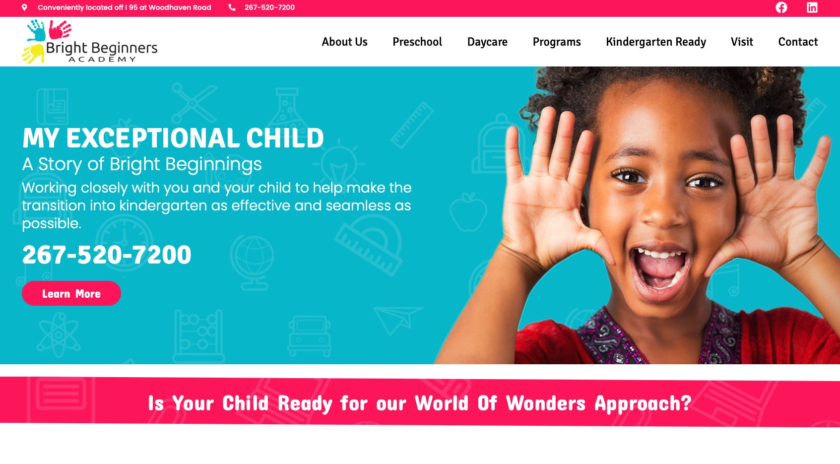
Bright Beginners Academy's website strikes an excellent balance between professional presentation and warm accessibility. Their site succeeds by highlighting specialized services and inclusive values while maintaining clean, modern design that appeals to contemporary parents.
What Works Exceptionally Well
Inclusive, Specialized Positioning: The prominent emphasis on autism-aware and inclusive environments differentiates Bright Beginners while demonstrating expertise in serving children with diverse needs. This positioning attracts families seeking truly inclusive care while building trust with all parents.
Professional Curriculum Framework: The "World of Wonders" curriculum branding creates a structured, proprietary educational approach that signals thoughtful programming rather than ad-hoc activities. Parents appreciate knowing their children are following a researched, comprehensive development plan.
Balanced Color Palette: Soft pastels and bright accent colors in blues, pinks, oranges, and greens create visual interest and warmth while avoiding cartoonish excess. The palette feels professional yet approachable – perfect for childcare positioning.
Clean, Modern Typography: The Poppins and Signika font combination creates playful yet readable typography that appeals to parents while maintaining professional credibility.
Quality Certification Prominence: STAR4 quality certification provides third-party validation of care quality, addressing skeptical parents' concerns with objective standards rather than just self-promotion.
Comprehensive Service Range: Clear presentation of infant through preschool programs, plus professional assessment services, positions Bright Beginners as a complete early childhood solution rather than limited-scope care.
Authentic, Diverse Imagery: Photographs showcasing children of various backgrounds in active, joyful engagement create emotional connection while demonstrating the inclusive values the site promises.
Areas for Potential Improvement
Homepage Visual Organization: Multiple competing visual elements on the homepage create slight clutter. Streamlining the initial visual experience could help visitors focus on key messages and calls-to-action.
Navigation Simplification: Consolidating some menu items could make information discovery more intuitive for first-time visitors unfamiliar with the center.
Content Hierarchy: Some text-heavy sections could benefit from better visual hierarchy through strategic use of headings, bullet points, and white space to improve scannability.
Key Takeaway: Bright Beginners Academy demonstrates the power of inclusive positioning and specialized services in childcare marketing. By prominently featuring autism awareness and professional assessments alongside their comprehensive curriculum, they attract families seeking truly inclusive environments while differentiating from generic daycare options. Their site succeeds by balancing professional credibility with warm, welcoming visuals that make all families feel valued and supported.
Conclusion: Key Takeaways for Your Daycare Website
After analyzing these 8 exceptional daycare and childcare websites, several critical success factors emerge that you can apply to your own center's digital presence:
- Market to Parents, Not Children: Professional, academic design consistently outperforms cartoonish, overly playful aesthetics. Your website should look like an educational institution, not an entertainment venue. Parents make enrollment decisions based on trust, safety, and developmental outcomes – not bright colors and cartoon characters.
- Educational Philosophy Front and Center: Whether Montessori, STEAM-focused, or proprietary curriculum, clearly articulating your educational approach differentiates you from basic childcare and attracts parents seeking developmental excellence.
- Transparency Builds Trust: Comprehensive information about staff qualifications, curriculum details, safety protocols, and facility features addresses parental concerns before they become objections. Nothing to hide = nothing to fear.
- Data and Outcomes Matter: Measurable results (kindergarten readiness rates, developmental milestones) provide concrete evidence of effectiveness that resonates with results-oriented parents.
- Technology as Differentiator: Parent communication apps, classroom streaming, and online scheduling address modern parents' expectations for transparency and convenience. Technology integration demonstrates you're keeping pace with contemporary childcare standards.
- Authentic Visual Storytelling: High-quality, authentic photography of real children in your actual environment builds emotional connection and trust far more effectively than stock images or cartoons.
- Mobile-First Essential: Busy parents research on phones during lunch breaks and commutes. Flawless mobile experience isn't optional – it's mandatory for conversion.
- Clear Differentiation: Whether flexibility (KidsPark), inclusive care (Bright Beginners), or Montessori methodology (Evergreen/Greenpoint), successful sites clearly answer "Why choose us over other options?"
If you're exploring tools to build your daycare website, check out our comparison of AI website builder examples to see which platforms deliver the best results for small businesses.
The Bottom Line: Your daycare website should position your center as a professional educational institution that happens to provide care, not a care facility that happens to include some education. This fundamental positioning shift – reflected in every design decision from color palette to typography to imagery – is what separates fully-enrolled centers with waiting lists from those struggling to attract quality families.
Ready to Transform Your Daycare's Online Presence?
At Vibe Otter, we specialize in creating professional childcare websites that convert researching parents into enrolled families and fill your enrollment roster.
Get Your Custom Daycare Website